Showing posts with label Assignment 2. Show all posts

29.10.13

Assignment two: Elements of Design

Links: Pinterest

One of my favourite types of subject is the point where industry and nature meet, so I decided to base this project on a tiny beach on the banks of the River Humber which I often visit with my children. The beach is set between a ship yard and a power station and is the home of three old ships, slowly decaying into the riverbed. 

Edward Burtynsky’s ‘Shipbreaking’ series documents the industry of dismantling and recycling ships in Bangladesh. India based Tasveer Journal describes the set as one of Burtynsky’s most poignant and increasingly significant in light of today’s environmental insecurity, describing ‘objective detachment and a desaturated colour palette of rusty oranges, cool blues and steely greys’. I have aimed to use a similar palette in my work as I feel it is fitting with the subject matter.
In order to complete the project, I visited the site on three separate occasions; a dull, rainy day, an early morning as the sun was rising and a relatively sunny afternoon as the sun was descending in the sky, creating some interesting shadows. Unfortunately, these shadows come with much more vibrant hues, so I have desaturated some images in post processing in order to create a more cohesive set.

01 – Tipped: The first shot in my set was taken in order to display a single dominating point in the frame. This is the only staged shot in my set and I added the gravel in order to add some interest. I found the shot worked best with the bottle set on the top left third as the third lines are a classic position for drawing the eye. This also gave to bottle space to ‘look’ into as it was facing downwards and towards the right side of the screen. The leading line created by the gravel trail promotes movement through the image.

02 – Cold: My reasons for positioning the subject in this image were quite different. The boy was placed to the edge of the image in order to show the vastness of space around him. If he had been standing mid shot, this would have had the effect of splitting the shot in half and therefore making it seem smaller. Secondary subjects such as the jetty and the Humber Bridge, several miles behind show the outer limits of the space. 

 03 – Sunk: The two subjects are fitting examples of my theme, industry and nature. Both elements are manmade, the rock seemingly being from some kind of wall. Over time, they have become so worn and weathered that they have almost become a part of the natural surroundings. The shot is taken from such a perspective that the boat and the rock appear to be almost the same size. Their positions in the shot balance each other and the leading lines in the mud draw the eye from the rock to the boat.


 04 - Stepping Stones: This image shows multiple points of interest creating a geometric shape. The three clumps of seaweed form a diagonal line leading towards the horizon. Along the horizon is the end of the jetty, echoed by a small grassy island. The horizontal and the diagonal lines create an implied triangle, being joined by the right hand edge of the shot.


 5 - BlackPaull Illuminations: The lights create a horizontal line reaching out from the right side of the shot and becoming very faint towards the left. I feel that the grasses, as well as creating foreground interest, add some weight to the left of the shot so make it feel more balanced.


 06 – Three Times Tall: The repeating pattern of the silver pipes echoes the lower row of silos. The horizontal lines of the silos and the vertical pipes create stability in the image reflecting the nature of the sturdy structures.


 07 - Saltend Skyline: This image of the power station displays a wealth of both vertical and horizontal lines. The lights accentuate the rhythm of the towers moving along the image, with the horizontal smoke giving direction to the movement.


08 – Jagged: The rock creates a definite diagonal line across the shot from top left to bottom right. This is echoed by a softer line to the lower left and intercepted by a second soft line bearing down from the top right corner. Although simple, the lines created are balanced and pleasing to the eye.


 09 – Road to Nowhere: The groove in the mudflats creates a curved line leading towards the rear of the shot. This follows the idea of an implied line leading into the background; however the curves give much softer, slower movement than a more direct line would. The clump of seaweed in the foreground gives a point of interest as a starting point to the movement.


 10 – Hull: The intention when taking this shot was to show the implied triangle created by the converging parallel lines of the hull. On uploading the photograph, I discovered that the curves of the top and bottom of the boat were more prominent. The two elements combined create a sweeping movement through the image.


 11 – Stuck: I found this metal bar jutting out from the pebbles and was unable to move it so decided to shoot it in situ. The angle of my shot shows the triangle which is implied when two parallel lines converge.


 12 – Grave: Triangles can also be created by implied lines between three subjects, for example, three people. The children in this image form an implied triangle with the two ends of the boat. The boat itself is also made up of several triangles.


 13 – Tracks: The tread shown in the tyre show rhythm flowing along its circumference. I have shown the hole and the edge of the tyre in order to bring an end to the rhythm, creating a more interesting image.

 14 – Edible: This image displays pattern as the repeating shapes spill over from all edges of the shot. Although the pebbles are not exactly the same shape, they are similar enough to create pattern.

I have thoroughly enjoyed this module and feel I have learned a great deal about what design elements work in an image and why. I have visited this beach many times over the past few years, yet this exercise has enabled me to create a much more diverse range of images than on previous visits. I feel that setting similar challenges on future shoots will enhance my creativity and lead to much more interesting images.

All images from this assignment can be seen in the corresponding Flickr album.

Assignment two: response to feedback

I was quite pleased with the response to my ‘Elements of Design’ assignment. I had taken shots on the same beach at three different times of day; however due to the subject matter, those taken on a dull, drizzly morning seemed the most successful.
My tutor mostly preferred the images taken without people in and I can see his point. The children in the image below distract from the intended subject which is the vertical lines of the pipes. He also feels that this image would be more effective with landscape orientation to create more of a sense of space. I agree that this would make the image fit better as part of the set but I prefer the portrait orientation as I feel it enhances the vertical lines which are the main subject of the image. I will revisit the sets to see if I have an appropriate replacement.


My tutor suggested some research on industrial landscape photographers as this is an interest of mine. I found the work of John Davies <http://www.johndavies.uk.com/> interesting and especially like his image of Agecroft Power Station: <http://gb.pinterest.com/pin/353110427005940617/>. Having spent much of my teenage years close to the power station featured in my assignment, I seem to have developed an admiration for their huge, silent form and love to photograph them when possible.
Research on John Davies lead me to Edward Burtynsky where I discovered several albums which appealed to me, especially one entitled ‘Shipbreaking’, a captivating album showing the dismantling of no longer needed single hulled ships. Like the old ship I photographed sinking into the mud, Burtynsky speaks of nature reclaiming ‘even the most ambitious of human incursions into the land’. Burtynsky has captured perfectly the feel of the massive ships becoming part of the landscape, evoking visions of a vast graveyard.
In response to this further reading as well as my tutor’s comments, I feel that some of my brighter images in the set would benefit from a re-edit, making the overall mood more consistent.
 

26.2.13

Assignment two: Elements of Design (draft)


The following images were taken for my assessment on elements of design. Although many of the images I captured were intended to show one particular element, on editing I found that there were often other elements involved which I had not originally spotted.

As one of my favourite types of subject is the point where industry and nature meet, I decided to base this project on a tiny beach on the banks of the River Humber which I often visit with my children. The beach is set between a ship yard and a power station so it truly embodies the industry/nature cross over.

In order to complete the project, I visited the site on three separate occasions; a dull, rainy day, an early morning as the sun was rising and a relatively sunny afternoon as the sun was descending in the sky, creating some interesting shadows.

01. The first shot in my set, ‘Tipped’ was taken in order to display a single dominating point in the frame. This is the only staged shot in my set and I added the gravel in order to add some interest. I found the shot worked best with the bottle set on the top left third as the third lines are a classic position for drawing the eye. This also gave to bottle space to ‘look’ into as it was facing downwards and towards the right side of the screen.


As a secondary element, I noticed several diagonal lines in the image; those forming the edges of the rock, almost creating a second frame and also the line which goes from the bottle, through the gravel and down towards the large shadow in the bottom, right hand corner. I feel that this line and shadow balance the shot, yet remain subtle enough for the bottle to remain the obvious subject.

2. My reasons for positioning the subject in ‘Cold’ were quite different. The boy was placed to the edge of the image in order to show the vastness of space around him. If he had been standing mid shot, this would have had the effect of splitting the shot in half and therefore making it seem smaller. Secondary subjects such as the jetty and the Humber Bridge, several miles behind show the outer limits of the space.


3. The two subjects in ‘Sunk’ are fitting examples of my theme, industry and nature. Both elements are manmade, the rock seemingly being from some kind of wall. Over time, they have become so worn and weathered that they have almost become a part of the natural surroundings.


The shot is taken from such a perspective that the boat and the rock become almost the same size. Their positions in the shot balance each other and the leading lines in the mud draw the eye from the rock to the boat.

4. Had the two points of interest, the boy and the grass in ‘Repel’ been facing each other, I might have set them further apart in the shot. However, as they are facing away, I felt that some space was needed for them to look into so placed them closer to the centre. I took care to balance the two subjects in the shot with regards to distance from the centre. The subjects are also positioned in opposite sections of the Z shape created by the jetty, the shoreline and the base of the image.


5. ‘Stepping Stones’ shows multiple points of interest creating a geometric shape. The three clumps of seaweed form a diagonal line leading towards the horizon. Along the horizon is the end of the jetty, echoed by a small grassy island. The horizontal and the diagonal lines create an implied triangle, being joined by the right hand edge of the shot.


6. ‘BlackPaull Illuminations’ shows a definite horizontal line reaching out from the right side of the shot and becoming very faint towards the left. I feel that the grasses, as well as creating foreground interest, add some weight to the left of the shot so make it feel more balanced.


7. Although there are children playing in ‘Three Times Tall’, it is the shapes in the background which stand out the most to me. The repeating pattern of the silver pipes echoes the lower row of silos. The vertical yellow lines on the silos lead the eye up to the pipes, creating upward movement through the shot.


8. ‘Saltend Skyline’ displays a wealth of both vertical and horizontal lines. The lights accentuate the rhythm of the towers moving along the image, with the horizontal smoke giving direction to the movement.
 
9. The focussed piece of rock in ‘Jagged’ creates a definite diagonal line across the shot. This is echoed by a softer line to the lower left and intercepted by a second soft line bearing down from the top left corner. Although simple, the lines created are balanced and pleasing to the eye.


10. The groove in the mudflats in ‘Road to Nowhere’ creates a curved line leading towards the rear of the shot. This follows the idea of an implied line leading into the background; however the curves give much softer, slower movement than a more direct line would. The clump of seaweed in the foreground gives a point of interest as a starting point to the movement.


11. The intention in ‘Hull’ was to show the implied triangle created by the converging parallel lines of the hull. On uploading the photograph, I discovered that the curves of the top and bottom of the boat were more prominent. The two elements combined create a sweeping movement through the image.


12. The subject in ‘Stuck’ is a metal bar which I found jutting out from the pebbles and was unable to move. The angle of my shot shows the triangle which is implied when two parallel lines converge.


13. Triangles can also be created by implied lines between three subjects, for example, three people.  When shooting ‘Grave’, I noticed that the children in this position formed a triangle with the prominent ends of the boat. The boat itself is also made up of several triangles.


14. The tread shown in ‘Tracks’ show rhythm flowing along the circumference of the tyre. In order to add interest, I have shown the hole and the edge of the tyre in order to bring an end to the rhythm.


15. ‘Edible’ displays pattern as the repeating shapes spill over from all edges of the shot. Although the pebbles are not exactly the same shape, they are similar enough to create pattern.


I have thoroughly enjoyed this module and feel I have learned a lot about what design elements work in an image and why. I have visited this site many times over the past few years, yet this exercise has enabled me to create a much more diverse range of images than on previous visits. I feel that setting myself similar challenges on future shoots will enhance my creativity and lead to much more interesting images.

31.10.12

Rhythm and pattern

 Rhythm and pattern in photography are fairly similar in the sense that both are a form of repetition. The difference between the two is that rhythm encourages movement of the eye across the image whereas pattern is more static. Pattern is most effective when it fills the frame with the suggestion that it spills out from all sides.
 
This example of pattern was taken on my phone in Nando’s when I saw the bottle tops stuck to the wall.
 
With rhythm, the repetition usually flows in just one direction. The rhythmic subject may spill out from opposite ends of the image, however some of the more interesting rhythm photography shows a natural break in the pattern.

These images by Hena Tayeb; (http://emptyeasel.com/2009/07/22/hena-tayeb-brilliant-rhythmic-photography/)  show skilled examples of rhythm:
 
 
 By showing the archways from an angle instead of straight on, Hena shows depth in the image. The shallow depth of field in the alligator tail also shows depth in the image which I have attempted to replicate in my dinosaur bone image.  
 
The bones flow from the bottom of the image to the top, with the rhythm being broken by the child’s hand at the top.
 
My rooftop shot shows a much more simple example of rhythm, leading the eye from left to right across the image.


Real and implied triangles


The triangular rock in this image leads the eye in several directions. The top point leads upwards towards the girl, who is the primary focal point. The side points lead the eye downwards and out to the sides, grounding the image and giving it width.

 The perspective in this shot makes the parallel lines in this phone box appear to converge towards the top. In hindsight, I feel the image would have benefitted from a more dramatic convergence gained with a wider angle lens or a steeper perspective.

In this shot, I feel I have gained a much steeper convergence. Although the same lens was used, this effect is as a result of the bridge being much longer than the phone box.

When using several items, I achieved the triangular shape by using a single tall item at the back and getting gradually smaller and wider towards the front. I also ensured that I had more items at the front to increase the width.

To achieve a triangle with the apex at the bottom, I used much shallower items in a line to form the back row. Slightly smaller objects were placed in front to form the apex and in this image, the light from the candles helps to enhance the triangular shape.

The faces in this image form a triangle which I feel creates quite a lot of movement. Although the faces are in a triangle, I feel that the implied lines form a bit of a zig-zag, going from the photographer’s camera to the younger man, following his eye line to the other photographer and then from his eye line and camera to the ground.


Implied lines


I took several photos of my niece and studied why some appealed more than others when essentially, they were all so similar. The coloured lines in these shots show the direction of movement through the image. The first image shows a curve to the top, yet it flows straight down at the bottom which I find quite abrupt. The second shot shows a flowing S shaped curve, so the line implied by Evie’s posture is much more pleasing to the eye.  I also feel that the soft flowing curve fits with the nature of the subject.

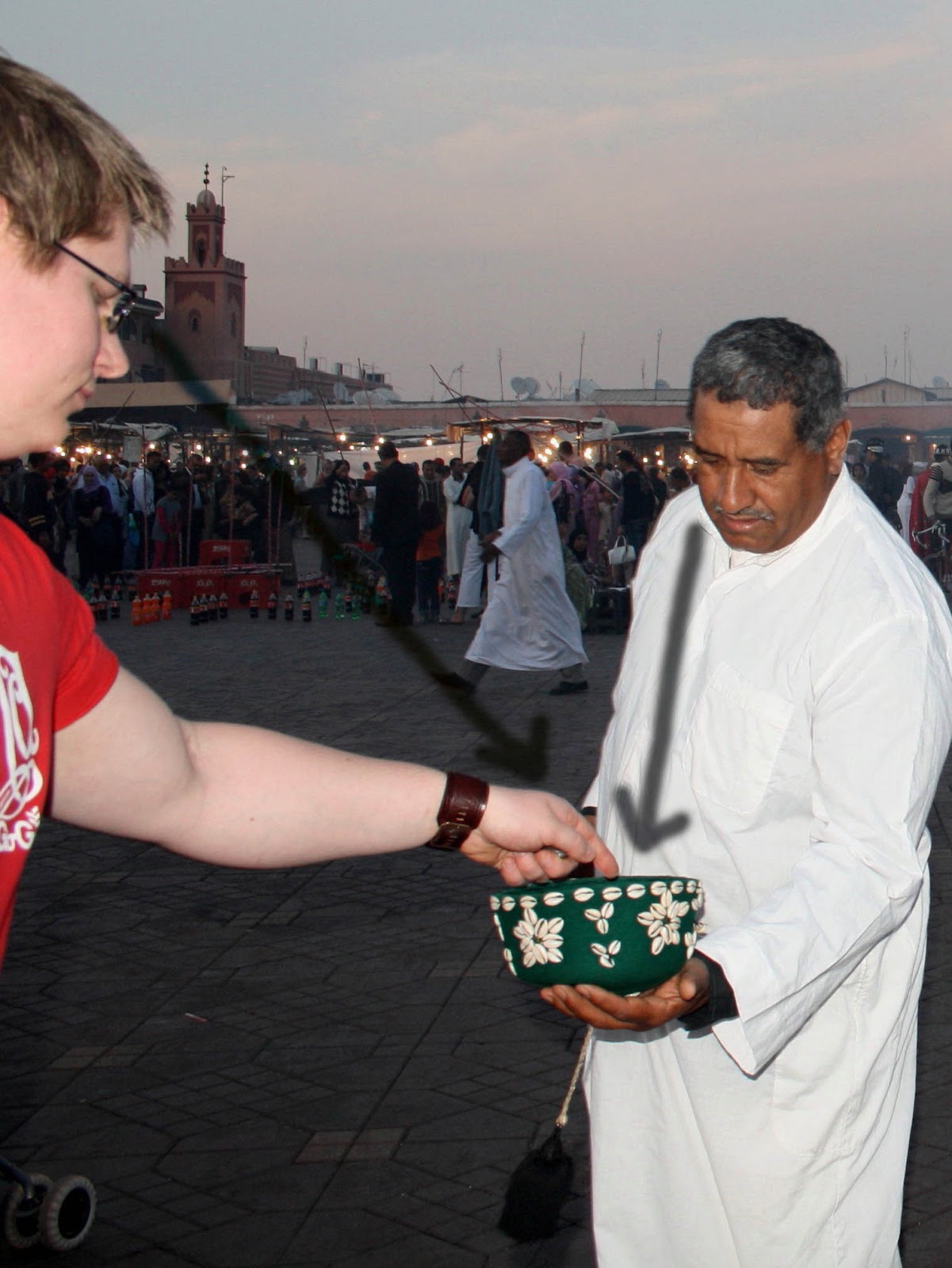
The two implied eye lines give a cue to follow down to the money bowl which was the main purpose of the encounter. The arms of the two men back up this cue to create quite a strong message that the bowl could be the main subject of the photograph.

There are two types of implied line in this shot; the circular line flowing down the tree and round to follow the branch above frames the children while the dino-tree’s eye line leads behind the big tree to show the direction they would be moving if it were a real dinosaur.

The major implied line in this shot is from the lighting equipment. This line works in a similar way to an implied eye line.

The implied lines leading from Jordan’s feet point directly towards the top corners of the frame. I think this has an anchoring effect on the image which could explain why an expectedly flowing shot would turn out so static.   

This photo shows how an implied line can lead the eye through an image. A similar effect would occur in pictures of roads, bridges or corridors.


Curves


I have found that curves also create movement in an image, however it is a much more flowing movement than with diagonal lines. The trunk of this tree makes the eye flow across the image in a sweeping motion.

The curve of this wall pulls the eye forwards into the shot and then sweeps round to the right.

The curve in this photo of my nephew sweeps round from the bottom and draws the eye up towards the face in a much more gentle way than a straight line would have.

The curve in this shot creates a complete circle which I feel make the shot even more static than horizontal lines. The only movement created is from the cat’s eye line, added to by the tail pointing in the same direction.