Showing posts with label Assignment 4. Show all posts

8.4.14

Assignment four: Applying lighting techniques

Links: Pinterest
The brief given for assignment four is to use one object to show the different lighting techniques studied in this unit. I had several objects in mind for the project but the one I felt held the most interest with regards to colour, form, shape and texture was an ornamental monk named Bud, belonging to my sister. 

The subject being human in shape directed me towards researching portrait photographers, particularly those who use interesting lighting techniques themselves. Yousuf Karsh, who shot to fame following his portrait of Winston Churchill; The Roaring Lion, has in his portfolio, images of many great heroes.  

Karsh’s images show great variety in posture and lighting to bring out the individual character of the subject. His portrait of Albert Einstein is lit from slightly behind so that the light skims across his face, highlighting the deep wrinkles which show great wisdom and character. French author, François Mauriac’s silhouette is given an aristocratic feel using edge lighting to highlight only the edges of his noble features. Karsh’s portrait of playwright, Bernard Shaw is lit from a high angle creating strong highlights and shadows in his face and clothing; Karsh has perfectly captured Shaw’s quizzical demeanour.
 
Although photographing an ornamental monk rather than a person, I still hoped to evoke feelings through my use of setting and light. Having considered the angles of light necessary to create my images, I then needed to think about the types of light I would use. Being the perfect time of year for stunning sunsets, I decided to start off my project using the natural light of the golden hour.
01 – Setting Sun: My first image shows the figurine sitting on the banks of the river with a beautiful sunset in the background; this being my lighting for the first part of my set, I thought it fitting that my first image should show it in all its glory. Placing Bud on a rock between myself and the setting sun, I set the exposure for the sky which had the effect of leaving the subject in total darkness, creating a silhouette to show the shape of the subject. The omission of detail reflects the monk’s meditative state.    

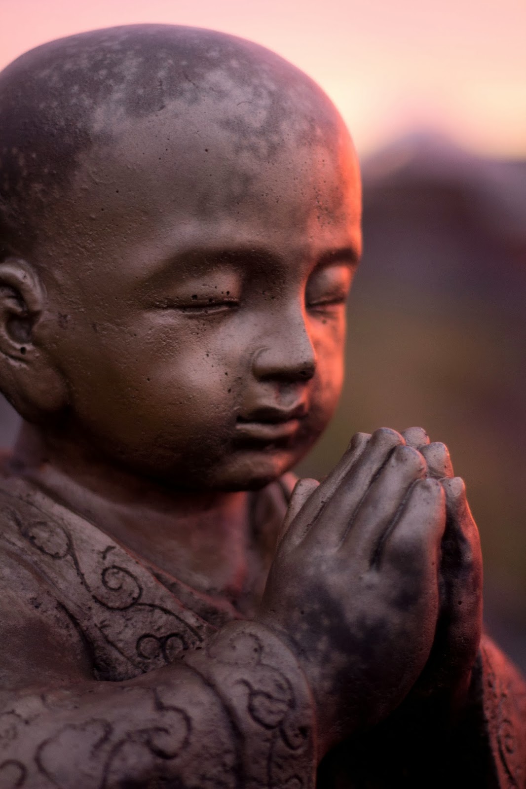
02 – Pink Prayer: In order to demonstrate colour, I moved around the subject and placed myself between it and the sun. This meant that now Bud was lit from the front, creating a flat but colourful image. In front lit images using neutral light, Bud’s colour is bright gold; however in this image, the colours of the sunset are reflected. The background colours are more down to luck than judgement as my main focus was on the direction of the light; however I am pleased with the resulting violet/green/orange combination of contrasting hues.

03 – Peaceful: Side lighting is used to show form as the highlights and shadows fall on the subject. This is most notable in the face as the rounded forehead casts a shadow across the eye.

04 – Glow: I positioned the subject so that the sun shone from a slight rear-side angle, hoping to show texture in the image. Although this wasn’t as successful as I’d hoped, I do like the effect the light has on the subject creating a glow to the side of the face. I have included this image although I feel that the main interest is its colour, rather than texture.
............................
For the next part of my project, I wanted to use artificial light while retaining the natural, outdoor setting for my images. I had the idea of using my car headlamps but as the figurine was so heavy, I needed a strong platform to raise him to the level of the lights. A nearby car park was edged with large rocks, perfect for purpose.
05 – Star: The headlamps gave me just enough focussed light to really enhance the texture in this shot. The rear-side angle enables the light to skim across the subject’s sleeve, trapping shadows in the sunken areas. The fading sunset adds colour to the opposite corner, adding movement and interest while the star remains the main focus.

06 – Cross-legged: This image also utilises the light skimming across the subject, creating dark shadows and drawing attention to the texture of the clothing.

07 – Golden Hands: In contrast to the deep lines displayed in the previous image, minimal texture is displayed in the subject’s clothing. The purpose of this front lighting, although flattening the image somewhat, brings out the golden hues in its surface. As noted earlier, this colour is very different from the oranges brought out by the light of the setting sun.

 08 – Rembrandt: Still using my car headlamps, I turned the figurine so that he was lit from the side. The acute lighting created a strong contrast image with hard shadows showing the form of the subject. Due to the triangular shadow under the eye, I have named this image ‘Rembrandt’. To enhance the depth of the image further, I used a shallow depth of field in order to soften the focus of the face.

09 – Wide: This image is also shot using side lighting; however the subject is turned to face the light and my lens is set to its widest angle of 18mm. The results is that Bud’s left foot appears much larger than his right; creating depth and therefore form in the image to compliment the effect of the lighting.

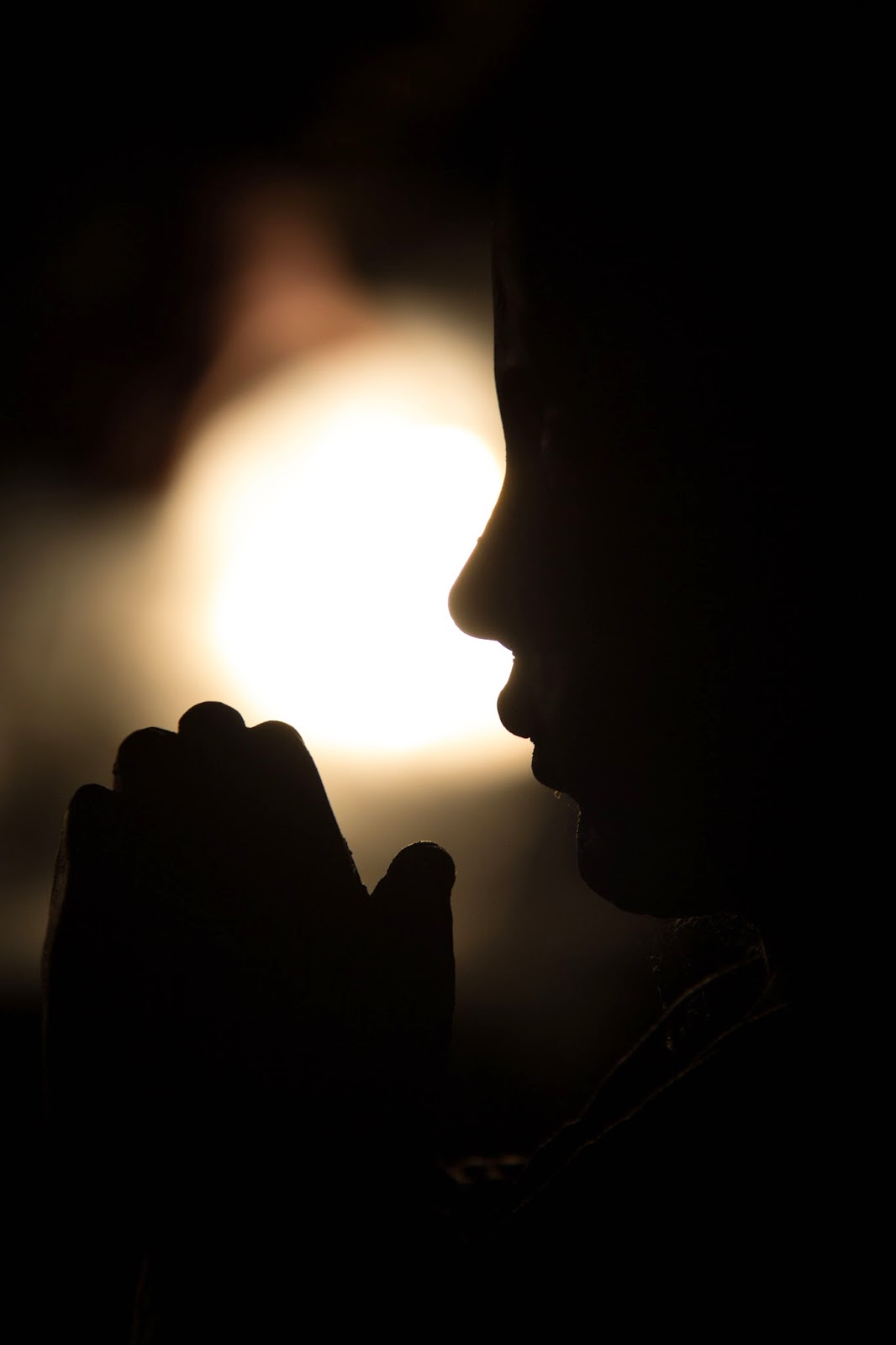
10 – Bedtime Prayers: My final image was taken using a diffuser to soften the glow from the headlamps. Again, shape is shown in the form of a silhouette, however in this image, the main subject is the backlit space between the face and hands. 
Although I have only used two forms of light in this set, one natural and one artificial, I have used them in a variety of ways to show the different physical qualities in my subject. As well as showing the given physical elements, I feel that I have utilised the lighting in a way which is sympathetic to the peaceful nature of the figurine.

All images from this assignment can be seen in the corresponding Flickr album.

25.3.14

Assignment four: response to feedback

Throughout the indoor lighting section of unit four, I had put a lot of thought into what I might use as a subject for the pending assignment; something which held interest in the four elements of the unit, colour, shape, form and texture. I was really pleased with my decision and the resulting images and even more so that my tutor appreciated the thought and effort that had gone into this assignment. Apart from a little confusion over an image I included to show the set up for the second part of my shoot, feedback was good.

My main challenge as I move towards unit five is to make my blog more accessible so that assessors can move around it more easily. I also need to add more information about my reading to my blog – although I have added reference to several photographers, my tutor feels that this area needs more depth; I intend to revisit the photographers I have studied, looking into critical writings on their work.
To enable easy access to my final images, I have uploaded to my Flickr page in labelled albums. I have also added a link to my Pinterest page for a one stop shop to images which have aided my learning during each unit.

29.10.13

Assignment four: Applying lighting techniques (draft)

The brief given for assignment four is to use one object to show the different lighting techniques studied in this unit. I had several objects in mind for the project but the one I felt held the most interest with regards to colour, form, shape and texture was an ornamental monk belonging to my sister.
The subject being human in shape directed me towards researching portrait photographers, particularly those who use interesting lighting techniques themselves. I discovered a photographer by the name of Yousuf Karsh who has in his portfolio, images of greats such as Einstein, Picasso, Mother Theresa and Winston Churchill.
Karsh’s images show great variety in lighting which enabled me to reinforce lessons learned during the course of this unit. Karsh’s portrait of poet, W.H.Auden is lit from slightly behind so that the light skims across his face, highlighting the deep wrinkles which give great character. Martha Graham is lit from the side, creating large areas of light and shade emphasising her three dimensional form whereas the back lighting in Pablo Casals’ portrait shows merely the shape of the cellist. Karsh’s portrait of François Mauriac also shows shape but by using edge lighting to highlight the very edges of his features.
The above images, as well as many others can be found on Karsh’s website: http://www.karsh.org/#/the_work/portraits
Having considered the angles of light necessary to create my images, I then needed to think about the types of light I would use. As we have been blessed with so many glorious sunsets this month, I decided to start off my project using the natural light of the golden hour.
01 – ‘Setting Sun’ shows Bud, the monk sitting on the banks of the river with a stunning sunset in the background. This being my lighting for the first part of my set, I thought it fitting that my first image should show it in all its glory. This is the image I had in my mind as we drove to the river so I knew exactly what I needed to do. Placing Bud on a rock between myself and the setting sun, I set the exposure for the sky which had the effect of leaving the subject in total darkness, creating a silhouette. The lack of detail in all other aspects forces focus on the shape of the subject.   
 
02 – In order to enhance colour in ‘Pink Prayer’, I moved around the subject and placed myself between him and the sun. This meant that now Bud was lit from the front, creating a flat but colourful image. In other front lit images using a more neutral coloured light, Bud’s colour is bright gold; however in this image, he reflects the colours of the sunset which lights him. The background colours are more down to luck than judgement as my main focus was on the direction of the light; however I am pleased with the resulting violet/green/orange combination of contrasting hues.

 
 03 - The side lighting in ‘Peaceful’ is intended to show form as the highlights and shadows fall on the subject. This is most notable in the face as the bulge of the forehead casts a shadow across the eye.

 
 04 – I positioned the subject in ‘Glow’ so that the sun lit him from a slight rear-side angle, hoping to show texture in the image. Although this wasn’t as successful as I’d hoped for purpose, I do like the effect the light has on the subject creating a glow to the side of the face. I have included this image although I feel that the main interest is in colour, rather than texture.

 
For the next part of my project, I wanted to use artificial light yet still wanted to keep the natural, outdoor setting for my images. I had the idea of using my car headlamps but as Bud is so heavy, I needed a platform strong enough for him to sit on. I found a car park nearby with just the right set up as shown below. 

05 – The headlamps gave me just enough focussed light to really enhance the texture in ‘Star’. The rear-side angle enables the light to skim across the subject’s sleeve, trapping shadows in the sunken areas. The fading sunset adds colour to the opposite corner, adding movement and interest while the star remains the main focus.
 
 
06 – The rear-side lighting in ‘Cross-legged’ also skims across the subject, creating dark shadows and drawing attention to the texture of the clothing.
 
07 – In contrast to the deep lines displayed in the previous image, ‘Golden Hands’ shows minimal texture in the subject’s clothing. The purpose of this front lighting, although flattening the image somewhat, brings out the golden hues in its surface. As noted earlier, this colour is very different from the oranges brought out by the light of the setting sun.
 
 08 – Still using my car headlamps, I turned Bud so that he was lit from the side. The acute lighting created a strong contrast image with hard shadows showing the form of the subject. Due to the triangular shadow under the eye, I have named this image ‘Rembrandt’. To enhance the depth of the image further, I used a shallow depth of field in order to soften the focus of the face.
 
09 – ‘Wide’ is also shot using side lighting; however in this image, the subject is turned to face the light and my lens is set to its widest angle of 18mm. The result shows Bud’s left foot looking much larger than his right; creating depth and therefore form in the image to compliment the effect of the lighting.
 
10 – My final image ‘Bedtime Prayers’ was taken using a diffuser to soften the glow from the headlamps. Again, shape is shown in the form of a silhouette, however in this image, the main subject is the backlit space between the face and hands.  
 
Although I have only used two forms of light in this set, one natural and one artificial, I have used them in a variety of ways to show the different qualities of my subject. I’ve developed quite a bond with Bud during this process and hope that he’ll model for me again in the future.

Shiny surfaces

For this project I chose a clear light bulb as I felt the round shape would be difficult to photograph, encouraging further learning. First, I took a shot of the bulb using one studio light with no diffusion. As shown, there are several burnt out areas on the bulb caused by the lighting, which is very distracting.
As instructed, I made a funnel out of tracing paper with one end taped to my lens, fitting perfectly around it and the other end, just large enough to fit round the object. I found this quite difficult as I could only find A4 tracing paper so, having taped three pieces together; I extended the funnel to the size needed by adding a length of grease proof paper on the end. I had previously tried to create the entire funnel using grease proof paper but it was too thin and floppy to stand straight.
 
My first image taken using my newly made creation was lit from front right, about half a metre above the subject. The burnt out areas were almost gone but the reflection of the layers of grease proof paper are shown in the glass.
 
A similar effect shows in the second image, lit from the same height as the previous shot but this time from behind and to the right.
 
My next shot shows the image lit from above. This had the result of reducing the uneven layers of light; however they are still slightly visible.
 
The last image using the cone was taken lit again, from above but with the light much higher, almost two metres above. A clearer image is produced, yet the cone is still visible in the bulb’s surface. I decided that with such a difficult subject and poorly made equipment, this was probably as good as I was going to get.
 
Having given up and screwed up the paper which had tested me to the limit by flopping about and encroaching on my shots, I suddenly had an idea. With the light in its previous position, I lay the scrunched up paper over the bulb so that it was completely covered. I set the camera almost on the ground and covered the route from camera to bulb with more paper. The resulting shot doesn’t have the best background, yet the bulb is lit more evenly than in any other shot.
 
I have learned a lot about lighting throughout this experiment; however my main lesson would be to buy a light-box and stop messing about with tracing paper – what a nightmare!

Concentrating light

In order to concentrate light on one particular area of the shot, I fashioned a homemade snoot from rolled up black card. I used various small props and experimented focussing the light from different angles.

Russian dolls – the lighting creates sharp shadows along the ground as well as throwing shadows onto the dolls. The background is much darker than if I hadn’t used a snoot as it has the effect of directing a narrow beam of light onto the subject.
 
Artist’s doll lit from above-left – a dramatic, high contrast effect, reminiscent of a theatre spotlight.
 
Plant lit from a slightly steeper angle – the light reflects off the corrugated pot, creating sharp highlights and shadows. A lot of the plant is thrown into darkness as only leaves facing the light are lit.
 
For this shot of my elephant, I set the light as high as I could, facing almost straight downwards with the beam of light shining down only on the face and trunk. Again, this creates a dramatic effect as the back of the elephant is in total darkness, leaving the face only partially lit.
 
As a result of the high contrast created using a snoot, dramatic and emotive images can be created. The narrow beam of light has the added benefit of throwing background clutter into darkness, giving an even backdrop.  

Contrast and shadow fill

In order to experiment with contrast and shadow fill, I used an artist’s doll as I felt the contours of the body and face would show contrast to its full extent. I lit the subject from the left and used various reflectors to fill in the shadows on the right.

In the first image, I used an undiffused light with no reflector. This image was generally brighter than the others because of the lack of a diffuser so I underexposed by half a stop; this ensured that the comparison was based on contrast alone. The harsh light from the left with none from the right gave this image the highest contrast of all. 
 
Moving through the images in order of contrast, the next was with diffused light from the left and again, no reflector. This was no surprise as I would expect high contrast with light only coming from one direction.


The next highest in contrast was the image using a white reflector one metre away. As this was the furthest distance used for a reflector, this was to be expected.


In fourth place came the image taken with tin foil, crumpled up and then straightened back out to form a reflector and held half a metre away with the shiny side facing the subject. I thought that with the light being scattered around, this would create less contrast than those taken with flatter tin foil but this was not the case. I suspect that as a result of the light being scattered, less was reflected back towards the subject so the shadows weren’t filled so efficiently.


 Next in line is the photograph taken using the shiny side of a sheet of tin foil, held half a metre away. Again, I had assumed that the shiny side would reflect back more light so am also surprised at this result. I wonder if surfaces which are too shiny have difficulty reflecting light evenly which could affect the result. I will look further into this in the near future.


 Second to last is the image taken with shadows filled using the dull side of the tin foil, held half a metre away. The matt surface reflects the light back quite well, leaving quite an evenly lit result.


The most evenly lit image is that using a white reflector, held half a metre away. The colour of the reflected light being white mirrors the white light provided from the left and creates the best shadow fill.
 

I have made several discoveries from this experiment; the most important being that distance and colour of reflection have an impact on contrast and shadow fill. The experiment with crumpled tin foil has given another option for shadow fill; in the case giving quite a high contrast result. I rarely use my studio lighting as I have limited space and prefer outdoor photography using natural light. Having done this experiment, I feel that it is an area I would like to revisit in the near future as I know I have a lot to learn on this subject.

The lighting angle

The purpose of this exercise was to study the effects of photographic lighting at different angles. Using lighting at a level with the subject and then around half a metre higher, I moved the light around the subject taking shots from the same position.

Shots taken with lighting at the level of the subject:
Position 1: rear-side
Starting with the shots taken at mid height, the first position was with the light slightly behind and to the side. I found that lighting the subject in this way gave a high contrast image creating a burnt out area to the left and very dark areas to the right. It was difficult to get a correct exposure all round with this position.
Part of the problem was due to space constraints at this angle; had I been able to move the light back slightly, the burnt out area may have been avoided.


Position 2: side
The two images below show lighting from the side of the subject. These again have resulted in high contrast images with burnt out areas. The texture of the subject is also more prominent in these images and I like the way the second image, lit from the right highlights the elephant’s facial features and makes it appear more three dimensional.  
 
 
Position 3: front-side
The two images lit from a front-side position are much more evenly lit. Highlights and shadows are visible on all areas of the subject and the textures are much more noticeable. The red tones, otherwise lost to high contrast are now more visible in areas facing the lighting.


Position 4: front
In this image much more of the subject is lit and much more evenly. This creates a flatter image, although interest is regained by the fact that the colours now appear much stronger. The texture on the underside of the image is noticeable for the first time.
 
Position 5: rear
In the final position at this level, all detail is lost as the subject is silhouetted as a result of light coming from behind. This position really shows nothing but shape; for this reason, I have turned the elephant round to show the strongest possible shape to create an interesting image.
 

Shots taken with lighting higher than the subject:
Position 1: rear-side
This image is lit much more evenly than the lower set image taken from the same direction. The highlights, especially to the head highlight the three dimensional quality.
 
Position 2: side
The form is accentuated even more in the images lit from the side; the head looks more bulbous when lit from the right than in any other position. This image reflects the contrast of the lower side lit shots but in a much more subtle way which is more pleasing to the eye.


Position 3: front side
This angle creates a more flat image than those shot with side lighting with subtle highlights and shadows remaining. Colour is much more pronounced in the areas close to highlights and detail such as the dirt on the elephant’s feet is more noticeable in this image.
 
Position 4: front
This lighting position not only has the effect of lighting the elephant but also provides lighting to the background, making the subject’s shape more defined. The lighting is quite even across the body, creating a flatter image, however there are clear shadows and highlights on the elephant’s face. This lighting has the effect of boosting colours, especially the red shades on the ear and back.
 
Position 5: rear
The rear lighting from above creates a similar silhouette to that of the lower back lighting, however in this image, highlights are shown across the top of the animal. Although the shape is the most notable feature created by this form of lighting, the subtle lighting shows form where the basic low lit silhouette does not.

Although this project was completed using only one light, it has shown many different affects that can be created with photographic lighting. This lighting can be used not only to create highlights but to strengthen colour and texture as well as enhancing three dimensional qualities.