Showing posts with label Assignment 3. Show all posts

29.10.13

Assignment three: Colour

Links: Pinterest
My aim in this assignment is to show how colour can be used in order to make a photograph more balanced as well as creating harmony and tension using complementary and contrasting colours respectively.

Complementary colours are those which face each other across the colour circle, such as red and green or orange and blue. The values poet, J.W.Von Geothe assigned to the primary and secondary colours according to their brightness are; yellow 9, orange 8, red and green 6, blue 4 and violet 3. These values can be used to enable us to create the correct proportions of colour in an image, those for complimentary colours being;
red:green – 1:1

orange:blue – 1:2

yellow:violet – 1:3
Harmony can also be created using similar colours, those which are close together on the colour wheel. This often consists of placing warm colours together such as red and orange or cool colours such as blue and green.

Colours spaced a third of the way round the colour wheel such as blue and red can create a striking contrast, sometimes to the point where they clash. This contrast can be used to create more striking images.
These colour combinations can also be used in the form of accent colours; created when a large area of colour is broken by a small splash of another colour. The uneven proportion of colour can create added tension in an image.
In completing this assignment, I have really struggled to create one cohesive set of images. While trying to develop my creative voice, especially with regards to colour, I have found myself flipping between the two extremes of my personality. I love colour; bold, bright, vibrant colours in big blocks appeal to the extrovert in me while my quiet, nature loving side feels at peace around the muted tones of a sun-bleached landscape... but do I have to choose?
My research first took me to a photographer described as a genius in colour, William Eggleston. Eggleston has a very distinctive style combining ordinary, everyday subjects with strong colours, often with a stylised, over processed feel. Whether photographing a bike or an elderly lady, Eggleston’s slightly surreal images evoke a tension akin to that of a Hammer horror film. Having originally worked in black and white, this photographer thrived at the introduction of colour; selective use of colours complement the awkward angles already used to create that Eggleston tension; this is an artist with a clearly defined voice.
Vienna born Ernst Haas became the premier colour photographer of the 1950s in the United States. Haas mainly uses colour subtly to create abstract images. His individual style, although distinct feels much broader than Eggleston’s with more variety in technique and subject matter.
One of my favourite photographers for his use of colour is Jay Maisel; Although Maisel has photographed many celebrities, I am more drawn to his distinct use of colour and light. The two images shown below are very different in tone and strength of colour; the vibrant, contrasting red and blue and the more muted, complimentary red and green evoke quite different feelings and it would be easy to think they were taken by different photographers. On viewing more of Maisel’s work, the link becomes apparent in his segmentation of colour; the third image, ‘Restaurant Roof’ shows that Maisel uses the same style when working with light. 
 
Before discovering Maisel, I had worried that in order to develop an artistic voice I would have to quash parts of who I am in order to pursue a particular type of photography. I now understand that this does not necessarily mean a choice between vibrant or muted colours or between landscapes and close ups but it is about the individual style in which these elements are used. Therefore, the images I have chosen for this assignment are not of a particular type; although unlike my draft piece, I have attempted to link the images in a more cohesive way. I feel that this submission is more developed than my ‘colour-by-numbers’ draft piece, as I am now satisfied that each image contains a little bit of me and that the project as a whole shows the varying shades of Jayne Arksey:
The set begins with a selection of vibrant close ups showing clearly defined complimentary and contrasting colours. Zooming out, we visit the equally bold, hues of a festival landscape, displaying colours working together on a larger scale.
As we move towards the more subtle hues of natural landscapes, the image ‘08 – Party Light’ creates a link between the two genres displaying the orange plastic against the earthy tones in the wood. As landscapes move from countryside to the Humber Estuary, we come full circle with a vibrant close up of the warning sign set against a contrasting blue sky.

01 – Text Talk: This image shows a red mobile phone cover against the green backdrop of a garden lawn. The complimentary colours are balanced in a 1:1 proportion, consisting of similar amounts of each hue. The visual simplicity of this image allows us to consider the significance of the image; the hands cradling the phone showing the importance of technology today.

02 – Sun Salutation: The 1:3 proportion of yellow to its complimentary violet creates harmony in this image. Had the photograph been taken from above, showing the petals to their full extent, the violet may have overpowered the yellow. This side view lessens the proportion of the violet area, creating balance. The deep green backdrop enhances the vibrancy of the image.

03 – Bins: The contrasting colours of the bins attracted me instantly but as they were in a busy festival field, it was difficult to get a shot from the right angle. On the last morning whilst eating breakfast, I finally got my shot. I composed in order to include less orange than green in line with Geothe’s proportions.

04 – Cool: This image shows how desaturation can affect the balance of an image. Although the proportion of complimentary hues, orange:blue is around 1:2, fitting with Geothe’s values, the orange drink obviously stands out as the main focus of the image. Factors such as depth of field and perspective play a part, however the intensity of the orange compared to the subtle blues really swing this balance. Where the blue background would have cooled the image, over-exposure creates a hot, white area to the right. I like the imbalance in this image; for me it creates a certain amount of tension which fits with the need for a cool drink on a hot day.

05 – Sundance: The yellow t-shirts fit perfectly with the outdoor environment as they link harmoniously with the grass and sky. I felt that using the greenery alone as a backdrop would create an overly yellow image; therefore I adopted a low angle to include more sky. As yellow, green and blue flow through the colour wheel mainly on the cooler side, harmony is created through similarity. The blue and green accents in the dancers’ outfits add a smaller, yet more intense version of these hues, balancing the bright yellow.

06 – Noisy Toys: This image shows an imbalance in colour which fits perfectly with the subject matter. The yellow hues in the banner and grass dominate the image, broken up by the purple accents in the text and backpack. Had the hues been reversed, the complimentary colours would be much more balanced, however the tension created works with the nature of the image. 

07 – Flame: Used as an accent colour, the lady’s bright orange hair contrasts dramatically with the greens of the grass and her vibrant clothing. Furthermore, there is a distinct imbalance in strength of colour as the lady’s friends are dressed in more muted tones.   

08 – Party Light: The orange accent created by the light provides a vibrant contrast to the green striped fence. This is softened by the rust colours and earthy muted tones.

09 - Amber: The upper portion of this image is filled with warm, golden hues. Although a similar colour, the cooler green of the t-shirt balances this warmth. Although a small part of the shot, I feel that the inclusion of the red trouser leg draws the eye to the similarly coloured lips, bringing attention to the girl’s face.

10 – Dawn: The early morning light warms the similar golden yellows and greens of the fields. The violet sky subtly complements the yellow while its contrast to the green below wakes up the sleepy morning scene.

11 – Meadow: The yellow dandelion provides an accent to the similarly coloured greens; however I feel that it is the complimentary link between the yellow and violet which creates the harmony in this image. Without the yellow accent, the green and violet create too sharp a contrast for such a relaxing image. If the violet were omitted, the similarity of the green and yellow would not create enough impact to generate interest.

12 – Dandy: The contrasting green and violet create a vibrant backdrop for the colourless clock; though the muted tones prevent the subject from being lost.

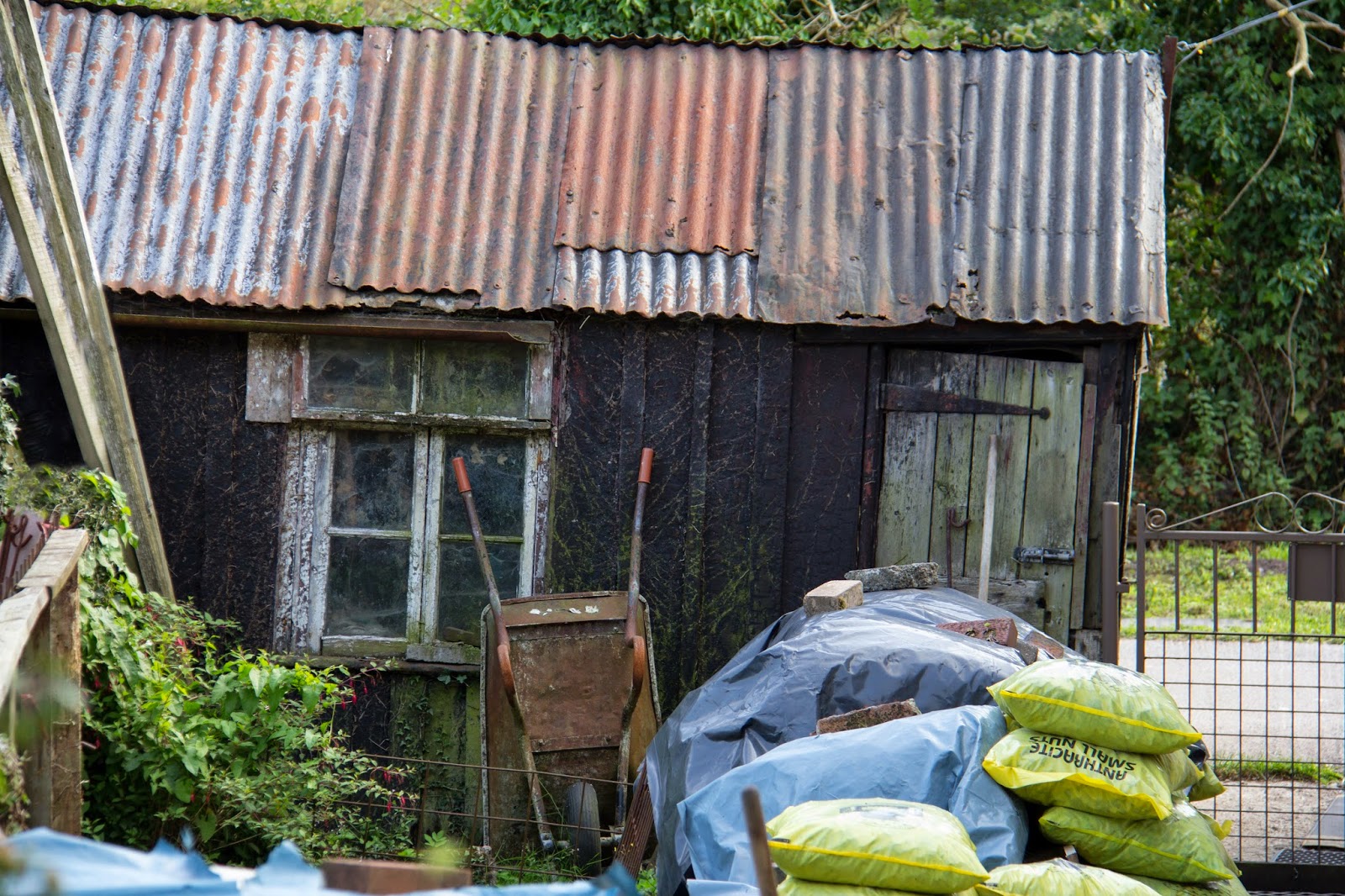
13 – Shack: Instinctively, I felt that the colours in this image balanced very well but didn’t really think about why until I had uploaded the image. The main subjects of the image are made up of the three contrasting hues; blue, red and yellow. The plastic sheeting and roof show the largest area but most muted tones of blue. Also on the roof and in the barrow, slightly smaller areas yet brighter tones of red are shown and then smaller yet more saturated patches of yellow are present in the bags. I feel that the green elements to the corners add a softness to an otherwise contrasting image.
14 – Ring: The similar hues of warm red and violet create a peaceful image with just enough blue to illustrate the coolness of a walk on the banks of the Humber. In a balanced image, the proportion of red:violet would be 2:1; however the sharper focus and detail in the ring aide to rectify the balance.

15 – Humber Accent: Warm hues are used in this image, using pale violet and pink with a red accent. A contrasting accent would have created great impact; however, as the image consists of similar colours, the boat sits calmly, adding interest but not detracting too much from the peaceful nature of the overall image.

16 – Warning: The calm blues are rudely awoken by the bright yellow warning sign while, although desaturated, the red highlights in the sky add to the contrast. Some harmony is restored by the muted violet river.

I have always had a fascination with colour and how it makes us feel so have enjoyed taking this interest further into the effects of varying colour combinations. I have intentionally steered away from staged scenarios as, although my style is still developing, I know that that I am much more attracted to real life situations. In some ways, I feel that this has made it more difficult to create a cohesive set as the colours have to exist in order to be photographed, however the added challenge has aided to open my mind to the world of colour. I feel that as I progress in the world of photography, this will be a significant aspect of my work.

All images from this assignment can be seen in the corresponding Flickr album.

Assignment three: response to feedback

My tutor feedback from Assignment 3 wasn’t quite as positive as that for the previous assignment; the main criticism seemed to be that the images, although fine individually don’t come together as one complete set. It’s a fair point, they don’t but I’ll try to explain how this came about:

·         Firstly, it didn’t cross my mind that there had to be an overall theme – naive I know but in assignments two, four and five, it specifies that a theme is required in the brief; however this wasn’t stated in this assignment. Having said that, I suppose I should have assumed; even if the subjects varied greatly, as a photographer it is expected that a certain style will emerge but this doesn’t show in this set.

·         The other issue was that the way I approached this subject was a little off the mark. I felt that setting out to complete an assignment in which so many combinations were necessary would be almost impossible without using set up situations. Instead, I spent a month or so, whenever I was out with my camera focussing my attention on the colours around me and capturing as I saw. I can now see that this has lead to a very disjointed set; however I still feel that I have learned more from this than a more coherent set of still life type shots. Maybe somewhere in the middle would have been the way to go.
However, even though this set is described as more efficient than creative, my tutor does say that I’ve got a decent intuitive command of colour so I’m pleased about that. As more of the technical aspects of photography become intuitive, I will be more able to concentrate on capturing the story and emotion behind my images. So what to do about it; I had a few options:

1.    Use the existing images but try to arrange them in a more cohesive way

2.    Use some of the images which work together and add more to try to create one consistent theme

3.    Find a middle ground and maybe use a few more of the images, creating a couple of separate  themes
I felt that more research was needed before deciding so I looked to the works of Eggleston, Haas and Maisel...
This research enabled me to reach a decision for this project; I decided to revisit my submission, selecting only the images which I felt were true to my developing style. Any images submitted purely as a result of fitting the criteria would be removed and replaced.

Finally, I had a plan!

3.9.13

Assignment three: Colour (draft)


My aim in this assignment is to show how colour can be used in order to make a photograph more balanced as well as creating harmony and tension using complementary and contrasting colours respectively.

Complementary colours are those which face each other across the colour circle, such as red and green or orange and blue. The values poet, J.W.Von Geothe assigned to the primary and secondary colours according to their brightness are ; yellow 9, orange 8, red and green 6, blue 4 and violet 3. These values can be used to enable us to create the correct proportions of colour in an image, those for complimentary colours being;

red:green – 1:1

orange:blue – 1:2

yellow:violet – 1:3

01. ’01 - Text-talk’ shows a red mobile phone cover against the green backdrop of a garden lawn. The large blocks of colour are balanced in a 1:1 proportion, consisting of similar amounts of each hue.

02. A red/green combination is also shown in ’02 – Bride’ although both colours are in much more muted tones.
03. The bright yellow centre of the flower in ‘03 - Sun Salutation’ is about a third of the size of the violet petals. Had the photograph been taken from above, showing the petals to their full extent, the violet may have overpowered the yellow. This side view lessens the proportion of the violet area, creating a more harmonious balance. 
 
04. ’04- Cool’ is an example of how a desaturation can affect the balance of an image. Although the proportion of orange:blue is around 1:2, fitting with Geothe’s values, the orange can obviously stands out as the main focus of the image. Factors such as depth of field and perspective play a part, however the intensity of the orange compared to the subtle blues really swing this balance. I like the imbalance in this image; for me it creates a certain amount of tension which fits with the need for a cool drink on a hot day.
 

Harmony can also be created using similar colours, those which are close together on the colour wheel. This often consists of placing warm colours together such as red and orange or cool colours such as blue and green.
05. The deep pink of the flowers in ’05 – Marry Me’ would be between red and violet on the colour wheel, which is very close to the violet of their backdrop. The similarity of the hues creates harmony in the image. Although the colours are similar, the slight blue edge to the violet backdrop cools the otherwise warm tones, giving a fresh feel to the flowers.
 
06. I spotted the row of boats in ’06 – Boat trip’ after taking my children rowing on the lake. The Vivid blues and greens are used to create harmony through similarity in the image.
 
07. The yellow t-shirts worn by the performers in ’07 – Sundance’ fit perfectly with the outdoor environment as they harmonised with the grass and sky. I felt that using the greenery alone as a backdrop would create an overly yellow image, therefore I adopted a low angle to include more sky. As yellow, green and blue flow through the colour wheel mainly on the cooler side, harmony is created through similarity. The blue and green accents to the outfits adds a smaller, yet more intense version of these hues, balancing the bright yellow.
 
08. While waiting for the comedian to appear at a recent festival, I noticed that the clothing of the two girls in ’08 – Tent’ almost mirrored the decor in the tent. I added this image to the similar colours section as the first thing I noticed were the blues of the hoodie and walls and the purples of the t-shirt and roof. On editing, I also noticed the golden tones in the girls’ hair and tent accessories which compliment the purples.


Colours spaced a third of the way round the colour wheel such as blue and red can create a striking contrast, sometimes to the point where they clash. This contrast can be used to create striking images.
09. The red leaves in ’09 – Flame’ create a dramatic contrast with the blue sky. When composing the shot, I kept Geothe’s values in mind, ensuring that the image contained slightly more blue than red.

10. The muted green and violet in ’10 – Dandy’ are too washed out to create a striking contrast; however the contrasting tones do add some interest to the image.
 
11. The bins in ’11 – Bins’ were in a busy area of a festival, making it very difficult to get a shot from the right angle. On the last morning whilst eating breakfast, I finally got my shot. I composed in order to include less orange than green in line with Geothe’s proportions.
 
 
12. Instinctively, I felt that the colours in ’12 – shack’ balanced very well but didn’t really think about why until I had uploaded the image. The main subjects of the image are made up of the three contrasting hues; blue, red and yellow. The plastic sheeting and roof show the largest area but most muted tones of blue. Also on the roof and in the barrow, slightly smaller areas yet brighter tones of red are shown and then smaller yet more saturated patches of yellow are present in the bags. I feel that the green elements to the corners add a softness to an otherwise contrasting image.


My final selection of images displays accent colours, created when a large area of colour is broken by a small splash of another colour. Accent colours can be used with complimentary, similar or contrasting colours.
13. A complimentary combination is shown in ’13 – Peek-a-boo’ with a red accent sitting in a large area of green, drawing attention to the little girl peeking through the door. The impact is muted slightly by the earthy tones interspersed with the greens.
 
14. The yellow flowers in ’14 – Meadow’ provide an accent to the similarly coloured greens; however I feel that it is the complimentary link between the yellow and violet which creates the harmony in this image. Without the yellow accent, the green and violet create too sharp a contrast for such a relaxing image. If the violet were omitted, the similarity of the green and yellow would not create enough impact for an interesting image.

15. The green of the cucumber in ’15 – Pimbino’ provides a vibrant contrast to the orange jug, enhanced by the uneven proportion of the two hues. This contrast, however is slightly softened by the red and yellow accents.

16. Warm hues are used in ’16 – Humber Accent’ with very pale shades of violet and pink. Had the background been blues or greens or the boat yellow, the impact of the accent would have been much greater. However, as the image contains similar colours, the red of the boat does not leap out of the page and demand attention in the way that a contrasting accent would. Instead it sits calmly, adding interest but not detracting too much from the peaceful nature of the overall image.


5.8.13

Colours into tones in black and white


The purpose of this exercise was to experiment with different coloured filters in black and white photography. I created a still life shot which included the colours red, green, blue and yellow and used Photoshop Elements to digitally create filter effects.
 
I converted the original image to black and white and set all the sliders; red, green and blue to the same level. This gave a very dark image which I used as a starting point each time. In order to then create the effect of a red filter, I moved the red slider up gradually until I was happy that the effect appeared obvious, yet still gave a pleasing image. As shown, the filter allows the red of the jugs to pass through, yet blocks opposite colours such as greens which appear very dark. I repeated the exercise, in turn moving the green and blue sliders with similar effect.  
The next task was to create the same image with a yellow filter. As the primary colours using light; red/green/blue are different from those we learn using paint; red/yellow/blue, the yellow filter would have to be created by enhancing both the red and green to create the effect of yellow. As expected, this had a similar effect to reducing the blue; the blues appeared darker and the yellows appeared lighter. I also created experimented with the effects of boosting blue and green together, having the effect of increasing cyan and reducing red and then boosting red and blue together, having the effect of increasing magenta and reducing green.
 
My favourite image in this experiment is the one using the yellow filter; the blue background and toothbrush have created a dark background and foreground, creating balance and more contrast in the image. My least favourite, probably due to the lack of contrast is the magenta version. In black and white photography, contrast is important in creating the lines and shapes which balance an image. Until now, I have always used the pre-set filter effects when converting to black and white but this experiment has given me the confidence to take control and find the right balance manually.


Colour relationships

Colour Relationships – part one

My mini-project on the red/green relationship taught me how different saturations of colour can have an added effect on the balance of an image. As I move onto other relationships; orange/blue, yellow/violet and beyond, I will focus mainly on images in which the colours used are of a similar level of saturation.

As discussed previously, red and green are well balanced in an image using 1:1 proportions because the two colours are equal in brightness. When using other colour combinations in their purest form, the proportions need to be adjusted in order to account for differences in brightness. German poet and playwright J.W.Von Geothe assigned the following values to the primary and secondary colours according to their brightness; yellow 9, orange 8, red and green 6, blue 4 and violet 3. These values can be used to enable us to create the correct proportions of colour in an image, those for complimentary colours being;

red:green – 1:1

orange:blue – 1:2

yellow:violet – 1:3

My project on red/green relationships showed these colours creating balance using 1:1 proportions. In order to create my orange:blue image, I placed an orange flower in front of a blue plant pot in a local garden centre. As the vase was much larger than the flower, it was easy to compose the image in order to create the 1:2 proportion.
 
I found an example of a yellow/violet relationship in my mum’s garden. Behind these bluebells were other plants, some being yellow and the yellow/green colour of grass, stalks and leaves. Using a shallow depth of field to blur the background colours and slight overexposure, I created a mass of yellow, complimenting the violet colour of the bluebells. Due to the nature of wildlife and the lack of a macro lens, the original image is slightly larger than the one shown but was taken with the intention of cropping to the correct size and proportions once uploaded.
 

Colour Relationships – part two
The second part of the exercise was to create more images in which the colour combinations appeal to me. I noticed my first example as my daughter was eating spaghetti, not the most attractive sight but the colours struck me as I watched her. Given the values red 6 and blue 4, the proportions should be red:blue – 2:3 meaning that there should be slightly more blue than red. This was a spur of the moment snap shot taken at proportions which I instinctively felt balanced. On studying the given rules, the proportion of red may be too high, however the combination appeals to me. The spaghetti and computer desk also give a slightly yellow element, completing the three primary colours, red/blue/yellow.
 
My second shot also shows the yellow/red/blue combination but in a different way. I originally took this shot to show the contrast in the old and new buildings without noticing the colours but as I looked through my photos for pleasing combinations, this kept jumping out at me. The positions of the colours appeal to me as well as the proportions, with the yellow buildings being framed by the blue sky and water. The blue and yellow alone might have created a rather lacklustre image but the vibrancy of the deep red brick buildings to the right and centre really draw my eye into the image giving warmth and depth.
 
The orange and green in this shot clash slightly, providing a contrast that may not appeal to all but works for me. I like the division of the shot with the top showing orange/red with a splash of green and the bottom green with a splash of orange. The expression on my daughter’s face works well with the citrus colours and the sharp contrast.
 
A photo shoot with friends provided my last two examples for this exercise. This old factory building with brightly coloured doors created a great backdrop and a selection of mats gave a wealth of options for colour combinations. In the first image, the orange in the yoga pants and door balance out the blues, also in the pants and in the mat. Although the proportions for orange:blue should be 1:2, the blue/cyan colour in the pants is very bright and a larger proportion of this colour would take over the image.
 
The last shot mainly contains a yellows and reds which according to Geothe, should show proportions yellow:red – 2:3. The proportion of red is higher than recommended as well as being the brightest form of its colour in the image. This gives a dramatic impact to the shot and draws attention to the bend in the girl’s body, showing the yoga pose to its full extent. I feel that the muted red wall surrounding the door and the muted yellow ground surrounding the bright yellow mat help to calm drama created by the more intense colours.  In all of the examples I have chosen, this is the only image made up of only warm colours, the others being a combination of warm and cool colours.
 

14.7.13

Colour Relationships - Red and Green


I have found this part of the course quite fascinating as I have always had an interest in the psychology of colour. I knew from past experience that I would find a wealth of red/green examples as this is my favourite combination and is found in abundance in nature as well as in manmade subjects. As I struggled to pick out one image to sum up my findings in this area, I have turned a few of my favourites into a mini-project within the set Colour Relationships project.
My first examples show a 1:1 ratio of red to green, fitting in with the given proportions. The leaves and tree bark have slightly muted colours in both the reds and greens creating balance in the images.


The picture of the boy shows much bolder, more pure versions of the two colours. Balance is again created with the 1:1 ratio, yet the intensity of colour creates a greater impact within the shot; the image feels much more vibrant and active which works well with the subject matter.

The carousel shot combines colour theory with the elements of design learned in the previous unit. This image is split simply across the middle with the green windows at the top balancing the red of the carousel and pebbles to the bottom. The vertical lines of the window frames lead down towards the ride while the triangular roof of the carousel leads up to the windows. If the colours had been more intense, I feel that the many lines in this shot may have created a cluttered, overbearing image; however the muted tones and simple division of colour work in almost the same way as a monotone image, enabling the main focus to be on the lines created.


While attempting to create a 1:1 ratio, I discovered that this did not always create a pleasing image. The red in the images of the tulip and the berries seemed to overpower the green, mainly because of an imbalance in the strength of the colours.


As in both images, the red appeared stronger; I recomposed to allow the more muted greens to come through.


My daughter gave me the opportunity to experiment with colour strength as she lay in a park wearing a red t-shirt. I took five shots of the same image, a stop apart varying from -2 to +2 and viewed the results. At -2 and -1, the red appears stronger than the green enabling the t-shirt to be the main focus of the image.

 
At the correct exposure according to my camera, the colours appear equally prominent and the lush green grass becomes part of the subject matter.
 
Moving onto +1, the red of the t-shirt is beginning to appear bleached leaving the green as the stronger colour.
 
By +2, the green still appears stronger than the red but neither appears particularly strong. The folds in the t-shirt which had before appeared black are now stronger in colour. Although the subjects intended for this purpose have been washed out, this is my favourite image of the set. This is because, with the bright colours muted, the main focus is now on Amber’s eye, showing her mood and giving a different feel to the image.
 
The ‘Private’ image shows that depth of field can also have an impact when balancing colours. Although the green is quite prevalent and of a similar strength to the reds, the softer focus lessens the impact and attention is drawn to the sharply focussed reds.

 
This element also comes into play in the image below. The vibrancy and size of the boxes would normally make them take over this image; however the soft focus lessens the impact. The leading line created by the two boxes also leads the eye towards the green caravan where the eye rests. I do not feel that the balance is fully corrected by the depth of field in this shot; however some movement and tension have been created by the imbalance which I feel makes it an interesting image.