I have found this part of the course quite fascinating as I
have always had an interest in the psychology of colour. I knew from past
experience that I would find a wealth of red/green examples as this is my
favourite combination and is found in abundance in nature as well as in manmade
subjects. As I struggled to pick out one image to sum up my findings in this
area, I have turned a few of my favourites into a mini-project within the set
Colour Relationships project.
My first examples show a 1:1 ratio of red to green, fitting
in with the given proportions. The leaves and tree bark have slightly muted
colours in both the reds and greens creating balance in the images.


The picture of the boy shows much bolder, more pure versions
of the two colours. Balance is again created with the 1:1 ratio, yet the
intensity of colour creates a greater impact within the shot; the image feels
much more vibrant and active which works well with the subject matter.

The carousel shot combines colour theory with the elements
of design learned in the previous unit. This image is split simply across the
middle with the green windows at the top balancing the red of the carousel and
pebbles to the bottom. The vertical lines of the window frames lead down
towards the ride while the triangular roof of the carousel leads up to the
windows. If the colours had been more intense, I feel that the many lines in
this shot may have created a cluttered, overbearing image; however the muted
tones and simple division of colour work in almost the same way as a monotone
image, enabling the main focus to be on the lines created.

While attempting to create a 1:1 ratio, I discovered that
this did not always create a pleasing image. The red in the images of the tulip
and the berries seemed to overpower the green, mainly because of an imbalance
in the strength of the colours.

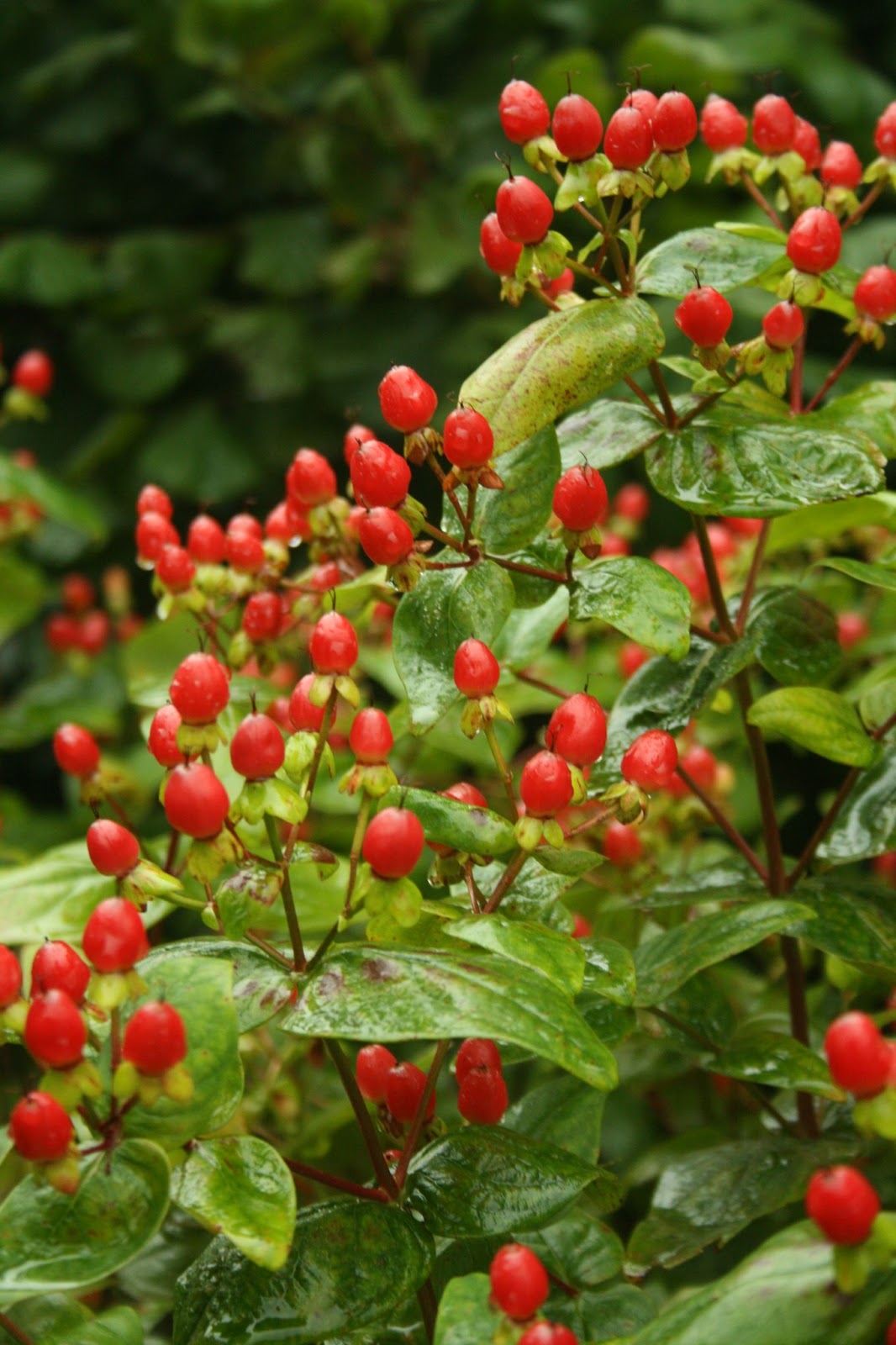
As in both images, the red appeared stronger; I recomposed
to allow the more muted greens to come through.


My daughter gave me the opportunity to experiment with
colour strength as she lay in a park wearing a red t-shirt. I took five shots
of the same image, a stop apart varying from -2 to +2 and viewed the results. At
-2 and -1, the red appears stronger than the green enabling the t-shirt to be
the main focus of the image.


At the correct exposure according to my camera,
the colours appear equally prominent and the lush green grass becomes part of
the subject matter.

Moving onto +1, the red of the t-shirt is beginning to
appear bleached leaving the green as the stronger colour.

By +2, the green
still appears stronger than the red but neither appears particularly strong. The
folds in the t-shirt which had before appeared black are now stronger in colour.
Although the subjects intended for this purpose have been washed out, this is my favourite image of the set. This is because, with the bright colours muted, the main focus is now on Amber’s eye, showing her mood and giving a different feel to the image.

The ‘Private’ image shows that depth of field can also have
an impact when balancing colours. Although the green is quite prevalent and of
a similar strength to the reds, the softer focus lessens the impact and
attention is drawn to the sharply focussed reds.


This element also comes into play in the image below. The vibrancy
and size of the boxes would normally make them take over this image; however
the soft focus lessens the impact. The leading line created by the two boxes
also leads the eye towards the green caravan where the eye rests. I do not feel
that the balance is fully corrected by the depth of field in this shot; however
some movement and tension have been created by the imbalance which I feel makes
it an interesting image.
