8.4.14

Assignment five: response to feedback

So, it seems my even numbered assignments are good, my odd numbers a bit pants... I’m starting to feel like a Star Trek movie!
Oh, where to begin... it was a massive decision whether or not to use this wedding for my project and I’m not sure I got it right. It was a family wedding so I was already combining business with pleasure but to add study to the mix was probably a step too far. My thinking was that, as I was already putting a concerted effort into getting the best images possible and it definitely fitting with the theme of a narrative, I couldn’t go wrong.

With the wedding done and the bride and groom happy with their album, I set about the job of reducing hundreds of wedding photos into a set of twelve or less for my assignment – but how, what element of the day would I use, an overview of the whole day, a specific part of the day, a theme... and why would my niece’s wedding be in a magazine anyway? This last question was the easiest to answer; on browsing a few wedding magazines, I discovered that they are full of stories and pictures of everyday couple’s weddings and for many different reasons. Some have had a quirky style of wedding so feel they’d like to show it off, others got married in beautiful surroundings or maybe have an interesting story fitting around the venue or how they met.
The original concept I produced needed improvement. Looking through the different layouts gave me several ideas on how to make my set feel more cohesive. 


The Knot magazine and Utah Valley Bride use a consistent colour scheme throughout, reflecting colours from the images into the background and text. In Cosmo Bride, it’s all about the editing, giving a vintage style to reflect the theme of the wedding while images in the article, ‘Rustic Romance’ have lots of soft focus fitting to the dreamy, romantic theme. I learned from this that I needed to keep a consistent background style as well as using images which work together.

While my tutor feels that my submission should show the more traditional, classic wedding photographs, I feel that this would stray too far from what I am trying to develop as my personal voice. Granted, the wedding album was full of group shots, confetti shots with the expected close ups of the rings, etc but that was for the couple; this assignment, I feel should show the shots which are true to my developing voice. With this in mind, 
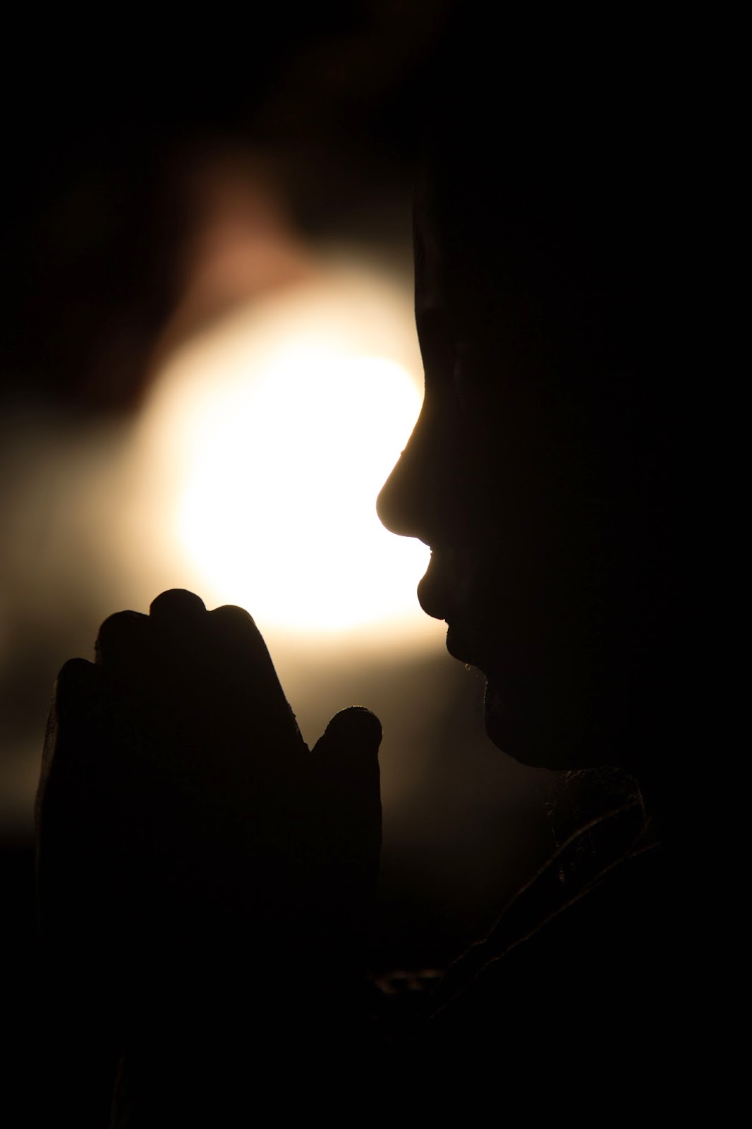
I have decided to focus purely on the lead up to the wedding. I feel that this is an element which is rarely covered in magazines, yet it is a vital part of the day, wrought with emotion and so many moments which may otherwise be forgotten after the events of such an important day.
I also need to address the fact that my tutor had stressed that I was maybe too emotionally involved in the wedding I used for this assignment with it being a family wedding. As part of my assignment, I had discussed the emotional side of the day for me as I felt that being ‘in the moment’ enabled me to create more moving images. While I can see his point that I maybe went a touch overboard, the article he signposted made me feel quite disillusioned as the author appeared to have such bitter feelings towards some of the weddings he photographed:
I see marriages doomed to fail even before the confetti falls, fathers shaking their heads in disappointment, grooms with a roving eye and bridesmaids who know too much.”
Surely, if these are the things a photographer is noticing, how can he possibly portray the love, hope and commitment which the customer is expecting to see in the forthcoming images? I’m sure his photographs are attractive and technically perfect but will they, in a small way, show the bitterness he feels? Unsurprisingly, this photographer has chosen to remain anonymous.
This article also bothered me as my one worry as I move towards a career in photography is that I lose the passion I currently feel. Granted, I often photograph things purely because they look nice but most of the time, it is because something has made me feel a certain way and I want my images to portray those feelings. I would hope that as my technical skills develop, my ability to do so will increase but if, like the aforementioned photographer, I lose that joy, that passion for showing how things have made me feel, then all the learning is wasted as I will be left with flat, meaningless images. Any artist, be it a painter, a musician, would advise that the only reason to take on a career in art should be for the love of that art form. This article, to me shows an artist who has lost that love.

To restore my faith in the true value of wedding photography, I have included a small selection of my favourite emotive images from Facebook Wedding Photographers, a group I regularly visit for inspiration:


Assignment four: Applying lighting techniques

Links: Pinterest
The brief given for assignment four is to use one object to show the different lighting techniques studied in this unit. I had several objects in mind for the project but the one I felt held the most interest with regards to colour, form, shape and texture was an ornamental monk named Bud, belonging to my sister. 

The subject being human in shape directed me towards researching portrait photographers, particularly those who use interesting lighting techniques themselves. Yousuf Karsh, who shot to fame following his portrait of Winston Churchill; The Roaring Lion, has in his portfolio, images of many great heroes.  

Karsh’s images show great variety in posture and lighting to bring out the individual character of the subject. His portrait of Albert Einstein is lit from slightly behind so that the light skims across his face, highlighting the deep wrinkles which show great wisdom and character. French author, François Mauriac’s silhouette is given an aristocratic feel using edge lighting to highlight only the edges of his noble features. Karsh’s portrait of playwright, Bernard Shaw is lit from a high angle creating strong highlights and shadows in his face and clothing; Karsh has perfectly captured Shaw’s quizzical demeanour.
 
Although photographing an ornamental monk rather than a person, I still hoped to evoke feelings through my use of setting and light. Having considered the angles of light necessary to create my images, I then needed to think about the types of light I would use. Being the perfect time of year for stunning sunsets, I decided to start off my project using the natural light of the golden hour.
01 – Setting Sun: My first image shows the figurine sitting on the banks of the river with a beautiful sunset in the background; this being my lighting for the first part of my set, I thought it fitting that my first image should show it in all its glory. Placing Bud on a rock between myself and the setting sun, I set the exposure for the sky which had the effect of leaving the subject in total darkness, creating a silhouette to show the shape of the subject. The omission of detail reflects the monk’s meditative state.    

02 – Pink Prayer: In order to demonstrate colour, I moved around the subject and placed myself between it and the sun. This meant that now Bud was lit from the front, creating a flat but colourful image. In front lit images using neutral light, Bud’s colour is bright gold; however in this image, the colours of the sunset are reflected. The background colours are more down to luck than judgement as my main focus was on the direction of the light; however I am pleased with the resulting violet/green/orange combination of contrasting hues.

03 – Peaceful: Side lighting is used to show form as the highlights and shadows fall on the subject. This is most notable in the face as the rounded forehead casts a shadow across the eye.

04 – Glow: I positioned the subject so that the sun shone from a slight rear-side angle, hoping to show texture in the image. Although this wasn’t as successful as I’d hoped, I do like the effect the light has on the subject creating a glow to the side of the face. I have included this image although I feel that the main interest is its colour, rather than texture.
............................
For the next part of my project, I wanted to use artificial light while retaining the natural, outdoor setting for my images. I had the idea of using my car headlamps but as the figurine was so heavy, I needed a strong platform to raise him to the level of the lights. A nearby car park was edged with large rocks, perfect for purpose.
05 – Star: The headlamps gave me just enough focussed light to really enhance the texture in this shot. The rear-side angle enables the light to skim across the subject’s sleeve, trapping shadows in the sunken areas. The fading sunset adds colour to the opposite corner, adding movement and interest while the star remains the main focus.

06 – Cross-legged: This image also utilises the light skimming across the subject, creating dark shadows and drawing attention to the texture of the clothing.

07 – Golden Hands: In contrast to the deep lines displayed in the previous image, minimal texture is displayed in the subject’s clothing. The purpose of this front lighting, although flattening the image somewhat, brings out the golden hues in its surface. As noted earlier, this colour is very different from the oranges brought out by the light of the setting sun.

 08 – Rembrandt: Still using my car headlamps, I turned the figurine so that he was lit from the side. The acute lighting created a strong contrast image with hard shadows showing the form of the subject. Due to the triangular shadow under the eye, I have named this image ‘Rembrandt’. To enhance the depth of the image further, I used a shallow depth of field in order to soften the focus of the face.

09 – Wide: This image is also shot using side lighting; however the subject is turned to face the light and my lens is set to its widest angle of 18mm. The results is that Bud’s left foot appears much larger than his right; creating depth and therefore form in the image to compliment the effect of the lighting.

10 – Bedtime Prayers: My final image was taken using a diffuser to soften the glow from the headlamps. Again, shape is shown in the form of a silhouette, however in this image, the main subject is the backlit space between the face and hands. 

Although I have only used two forms of light in this set, one natural and one artificial, I have used them in a variety of ways to show the different physical qualities in my subject. As well as showing the given physical elements, I feel that I have utilised the lighting in a way which is sympathetic to the peaceful nature of the figurine.

All images from this assignment can be seen in the corresponding Flickr album.