11.10.13

Cloudy weather and rain

Comparing sunlight and shade: 

The first task for this exercise was to photograph the same view in sunlight and under cloud while keeping the camera on the daylight setting.
While visiting my sister this week, I noticed that the clouds were flowing across the sky creating intermittent shade. I took the chance to go outside and photograph a little friendly Buddha sitting on her garden bench. I set the ISO to 100 and the aperture to 1.8 for both shots. The first image, taken in sun came out a vibrant gold colour and the shutter speed selected by the camera was 1/800. As soon as cloud covered the area, I took my next shot; it came out a much more silvery blue colour than the first and I was surprised to see such a dramatic different in a shutter speed of 1/100, three stops higher than the shot taken in sunlight.

The next morning while hanging out the washing, I noticed the sun shining onto this garden spade. As sun is quite scarce at the moment, I grabbed the opportunity to take the shot. Luckily, only about an hour later, I managed to get a shot of the same spade in shade. Yet again, the shot taken in shade was much bluer than that taken in sunlight. Both shots were taken at ISO 100 and AV 2.0; the shutter speeds used in sunlight and cloud were 1/2000 and 1/500 respectively, showing a two stop difference.
 
As I took the second shot of the spade, I noticed that the outside tap was now in sunlight. I kept the ISO at 100 and changed the aperture to 4.0 for a greater depth of field. As I didn’t have the time to wait for cloud cover, I asked my son to stand next to the tap, blocking the sunlight in order to create the same effect. Yet again, the shade made the image appear bluer than the one taken in sunlight and shutter speed increased from 1/500 to 1/125; a difference of two stops.
 
I wonder if the Buddha showed the larger difference in exposure as a result of the shiny surface reflecting the sun back towards the camera’s sensor.


Cloudy weather:


I recently had the opportunity to join a group of photography enthusiasts in Aylesbury as a friend of ours had a collection of her photographs in a local gallery. The collection, entitled Reflections was a selection of images taken in lakes and puddles, many of them turned upside down to create her works of art. After visiting the exhibition, we took a stroll along the canal and to suit the occasion, it turned out to be a dull and rainy day. I took this opportunity to take some photographs for my project on cloudy weather and rain.

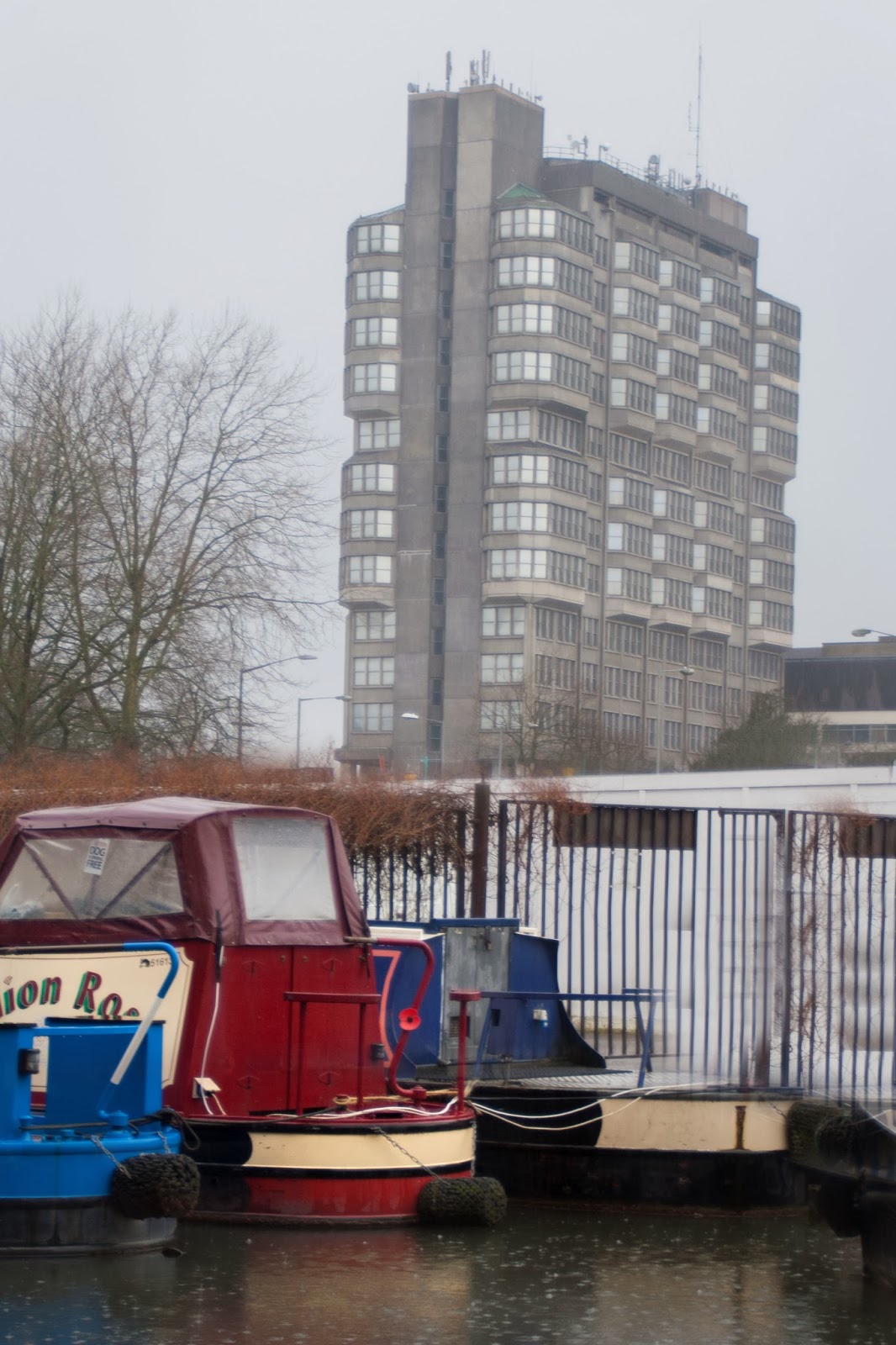
My first image is of what many describe as the ugliest building in Aylesbury but I think it’s quite fascinating. I thought the dull day fit perfectly and enhanced the greyness of the building; as a contrast to this, I kept the brightly coloured boats in shot.
 

Further along the canal, I spotted some graffiti on a wall. I feel that the flat lighting creating much muted colours to the left of the shot serve to enhance the colours of the wall and graffiti.
 

Shooting through a tunnel, I created silhouettes of my friends sheltering from the rain. Had it been a very sunny day, these shots may not have been as successful as the views behind the people would have been burned out. Again, the bright colours of the boat and graffiti are enhanced by the lighting.


My final two images for this section show a sorry excuse for a beach hut, thrown further into disrepute by the storm clouds lofting above. The cheerful font and vibrant colours serve as a perfect contrast to the misery of the scene.


Rain:

I thoroughly enjoyed this section as rain is one of my favourite types of weather. My first image was taken on holiday last year, not for this course but because as I was sitting watching the rain, I was amused by the juxtaposition of the rain resting on the summer garden furniture.


The next image was taken during this summer’s holiday and was taken with this exercise in mind. I love the vibrant colours set against the dull lighting but my favourite thing about this image is the ‘let’s get on with it’ ethos which it shows, summing up the general feel of a festival; the summer bunting against the umbrellas in the crowd, the varying footwear, or lack of it on the children and the fact that despite the rain, the band are still pulling in a decent crowd. As I took this shot, I was sitting under a tree to protect my camera from the rain and it still brings a smile to my face as it did on the day.

The last set of images was taken during an enormous downpour, the type which has always had my children and I running for the biggest puddle. I had just bought a sturdy raincoat for my camera and grabbed the opportunity to try it out. As we walked around the village, the kids were only too happy to pose for the camera; these are three of my favourite shots of the day.


I have to say, this has been my favourite exercise so far; not only have I learned a lot but we've had lots of fun creating the images required! :-)
 

Variety with low sun

Although this exercise could be completed using several subjects, I felt that I could learn a lot by comparing images of the same subject shot from different directions. I chose a slatted garden chair as I felt that the framework would create interesting shadows.

My first image is shot using frontal lighting. Apart from the shadow cast to the rear, there is not much interest in this image. The lighting appears very flat and there are few visible shadows on the chair. My instant reaction is to compare this image to those using on-camera flash; the light coming from the front has the effect of flattening the image. I will try to remember this when studying artificial lighting in future units.
 
 
The image taken with side lighting shows much more contrast; the slats of the chair creating strong shadows. The strong contrast has made it difficult to expose correctly; I feel that the lit parts of the chair are overexposed while the shadows are very dark.
 
The second image using side lighting was a little easier to expose as the light in this area was less bright.
 
I was quite pleased with the result of shooting the chair using back lighting. Parts of the chair are almost silhouetted against the bright background showing the strong lines of the slats. If the chair hadn’t created such a strong shape, this image would have been less successful; the shape becomes the subject as a result of the strong backlight.
 
I struggled to grasp the technique of edge lighting, not quite managing to achieve using the chair. I think I might have cracked it in this image of a pair of plant pots shot in a local garden centre. Using the hedge as a dark background, the top edges of the pots are lit by the sun behind. This kind of lighting helps to define the shape of the pots.

I will keep these findings in mind as I move towards experiments using artificial lighting.


Light through the day

One fine morning on a holiday in North Wales, I managed to wake up at six o’clock. As I wandered over to the wash rooms, I decided this would be a good time to start my exercise on light through the day. I wasn’t sure quite what weather to expect but hoped for the best.

My 06:00 image has quite a lilac hue to it and quite flat lighting as although the light from the sun is visible, it hasn’t yet broken the horizon. There is a fine mist over the hills omitting most of the detail of the trees and shrubs.
 
What a difference an hour makes. By 07:00, the sun has risen above the horizon and cast a pale yellow glow over the fields. Shadows can be seen on the hills and there is a striking contrast between the brilliantly lit barn end and the much darker side wall. The sky is a very pale blue, almost white.
 
By 09:00, the sun has begun to move behind the barn. The shadows of the foreground hedgerow have lengthened, yet the lighting on the hills behind has again, become quite flat. Some of the golden glow from earlier is retained in the foreground grass.
 
I get the feeling that my flat 09:00 shot may have been due to cloud passing over as by 10:00, the detail has returned to the hills. The hue is changing from the golden yellow to a deeper green and the shadows have become much shorter as the sun rises in the sky.
 
By 11:00 the foreground shadows are almost lost and the lighting on the barn has regained the flatness of the 06:00 shot. Partly as a result of the flatness in the foreground, my eye is drawn to an interesting patch of sunlight half way up the hill. As a whole though, this image is not striking.
 
13:00 and I realise I have not been blessed with the sunny day I’d hoped for but I feel I will have enough information to see results from this exercise. My attention is now drawn to the white barn roof and the yellow corn field as well as the white patch of sky to the far right which seems to be lighting the area. It is obvious that the sun has moved across the sky, the light on the hills is now flat, as is the majority of the picture.
 
15:00 brings a very flat image, quite different from the golden contrast seen this morning. Dull and lifeless, this image would have been deleted straight away if it weren’t for this exercise.
 
By 16:00, things are beginning to get interesting again. The hills in the background appear more golden in this image as does the grass to the foreground. As the sun moves round to the right of the shot, detail is beginning to show in the wood of the barn wall and the telegraph pole.
 
Although the background hills and sky appear quite flat, by 17:00 the yellow hue is returning to the foreground along with more contrast to the barn and pole. The corn field has also taken on a more golden hue.
 
19:00 brings flatter lighting yet has a lovely warm tone, slightly more orange than the yellow hue of the morning. The flat light prevents this image from being a favourite but I find the colours quite calming and appealing.
 
By 20:00, the interesting light is now long gone and we are left with flat, insignificant colours. An hour later it had become too dark to take a photo of this scene without long exposures so as the interesting light had subsided, I let this be my final image.

Before doing this exercise I was aware of golden hours and have, on occasion timed arranged shoots around times in the evening when the light is at its best. Having studied these images, I feel the morning light has a totally different quality to that of the evening and will try to incorporate this into my future photography where possible.


Judging colour temperature


White balance on daylight:

A sunny afternoon, sitting under the shade of a tree gave me the perfect opportunity to start the exercise on judging colour temperature. I chose my reluctant daughter as a subject and coaxed her from the rock she was perched on, reading to get my full sunlight shot. The strong sunlight has enhanced the shadows created by her furrowed brow but as far as I remember, her skin looks pretty much as I saw it on the day.

Having read the information accompanying this exercise, I expected the photo taken in shade to appear blue and the one in low sun to appear orange. However, I don’t think this is quite the result achieved in the following images. When I edit a RAW image, the options for changing white balance are to change the temperature, with sliders merging from blues to oranges or the tint, in which the sliders merge from green to pink. My photo taken in the shade appears to me to have a green tint rather than the blue I was expecting. I found that in order to get a better colour, I had to increase the temperature slightly but make a more extreme adjustment to the tint.


For the low sun image, I took two separate images, the first in the evening by the sea as the sun was beginning to set. In this image, Amber’s skin appears slightly pinker than I remember which could be combated by adjusting the tint slider.  


The next evening we had a view of a stunning sunset from our campsite so I asked Amber to pose yet again so that I could get a comparison. The effects of the low light has again, resulted in a more pink image than required. In this image however, I feel that Amber’s right cheek has a pink glow, whereas her right cheek seems to be a little blue. This could be due to all of the red light coming from the right. I have noticed whilst driving many times than whilst having a brilliant orange sunset in front of me, I can often see a very blue sky in my rear-view mirrors. This variation in light could create difficulty in finding the perfect white balance for such an image.


White balance on auto:
As I had such a portable subject, I decided to use Amber’s face to complete part two of the exercise. The next step was to set the white balance to ‘auto’ which would enable the camera to decide on the setting by reading the available light. My expectation was that this would give an ideal white balance for the subject in all situations; however this was not the case.
The first image, taken in full sun came out just a touch more blue/green than I remembered. Although this shot was taken in full midday sun, the colour temperature of this image read as 4700, whereas my camera’s setting for daylight is 5150. I can only assume from this that my camera did not view the scene as completely neutral but it was compensating for a colour cast due to the surroundings.


The image taken in the shade which had appeared green on the daylight setting appeared much more blue on auto. In this situation, I might have expected my camera to recognise the shade and opt for a temperature of 6850 which is its setting for shade. Instead, it opted for a much lower temperature of 4400 making me assume that my camera thought we were indoors. The only explanation I can think of for this is that we were under a tree with a small lake to one side and an electrically lit stage to the other. These factors could have had an impact on the setting given.

The third image is the closest to natural skin colour of all of the shots taken on the auto setting. It does, have a pinkish tinge but I feel the temperature is just right.

The fourth image has a slightly more blue hue than I would have expected. As suggested above, this scene would have been difficult to assess, manually or in camera as a result of the multi-coloured sky.
 
White balance on shade:

The last part of this exercise was to set the white balance to shade in camera and take the same shots again. My camera’s setting for shade is 6850, which has the effect of creating a more orange image.
The daylight image taken on the shade setting resulted in a much too orange image.
 
 
The image taken in shade is the one I would have expected to be correct, however the result is far too green, still with a hint of orange. Having studied the three images taken in shade and thought about the way my camera reacted to this situation, I feel the need for a retake. I plan to take another three shots in shade in the near future, making sure that there are no other contributing elements such as water or nearby electric lighting.
 
The first low sun image appears to orange, indicating a higher colour temperature than necessary.
 
The second low sun image is fairly close to the colours I would expect. The shade setting has increased the temperature on the left side of Amber’s face which was essentially in shade. The right side of her face shows an orange glow which gives the impression of a sunset coming from this side without actually seeing it. I feel this is the most successful of my images on this setting.
 
This exercise has taught me a lot about white balance as well as showing that it is not always best to leave such decisions to the camera’s auto setting.


Higher and lower ISO


The following exercise shows how increasing the camera’s sensitivity can aid shooting in low light conditions. The following images show the same photograph taken at ISO 100 (left) and ISO 800 (right). The initial difference I noticed was that as a result of the higher sensitivity, I was able to decrease the shutter speed creating a much less blurred shot. All comparable shots below were taken using the same aperture so that changing the ISO affected shutter speed only:


 It is clear from these images that the images taken at ISO 800 are much less blurred, showing the benefits of using a higher sensitivity. One drawback however is that as the ISO is increased, a speckled texture known as grain appears in the image. The image shows a close up of a section of the red rose at both sensitivities; it is clear that more grain is shown at ISO 800, especially in the darker areas.
 
My last two images show an increase in sensitivity from ISO 100 to ISO 400; even at this setting, grain is increased in the image.