29.10.13

Shiny surfaces

For this project I chose a clear light bulb as I felt the round shape would be difficult to photograph, encouraging further learning. First, I took a shot of the bulb using one studio light with no diffusion. As shown, there are several burnt out areas on the bulb caused by the lighting, which is very distracting.
As instructed, I made a funnel out of tracing paper with one end taped to my lens, fitting perfectly around it and the other end, just large enough to fit round the object. I found this quite difficult as I could only find A4 tracing paper so, having taped three pieces together; I extended the funnel to the size needed by adding a length of grease proof paper on the end. I had previously tried to create the entire funnel using grease proof paper but it was too thin and floppy to stand straight.
 
My first image taken using my newly made creation was lit from front right, about half a metre above the subject. The burnt out areas were almost gone but the reflection of the layers of grease proof paper are shown in the glass.
 
A similar effect shows in the second image, lit from the same height as the previous shot but this time from behind and to the right.
 
My next shot shows the image lit from above. This had the result of reducing the uneven layers of light; however they are still slightly visible.
 
The last image using the cone was taken lit again, from above but with the light much higher, almost two metres above. A clearer image is produced, yet the cone is still visible in the bulb’s surface. I decided that with such a difficult subject and poorly made equipment, this was probably as good as I was going to get.
 
Having given up and screwed up the paper which had tested me to the limit by flopping about and encroaching on my shots, I suddenly had an idea. With the light in its previous position, I lay the scrunched up paper over the bulb so that it was completely covered. I set the camera almost on the ground and covered the route from camera to bulb with more paper. The resulting shot doesn’t have the best background, yet the bulb is lit more evenly than in any other shot.
 
I have learned a lot about lighting throughout this experiment; however my main lesson would be to buy a light-box and stop messing about with tracing paper – what a nightmare!

Concentrating light

In order to concentrate light on one particular area of the shot, I fashioned a homemade snoot from rolled up black card. I used various small props and experimented focussing the light from different angles.

Russian dolls – the lighting creates sharp shadows along the ground as well as throwing shadows onto the dolls. The background is much darker than if I hadn’t used a snoot as it has the effect of directing a narrow beam of light onto the subject.
 
Artist’s doll lit from above-left – a dramatic, high contrast effect, reminiscent of a theatre spotlight.
 
Plant lit from a slightly steeper angle – the light reflects off the corrugated pot, creating sharp highlights and shadows. A lot of the plant is thrown into darkness as only leaves facing the light are lit.
 
For this shot of my elephant, I set the light as high as I could, facing almost straight downwards with the beam of light shining down only on the face and trunk. Again, this creates a dramatic effect as the back of the elephant is in total darkness, leaving the face only partially lit.
 
As a result of the high contrast created using a snoot, dramatic and emotive images can be created. The narrow beam of light has the added benefit of throwing background clutter into darkness, giving an even backdrop.  

Contrast and shadow fill

In order to experiment with contrast and shadow fill, I used an artist’s doll as I felt the contours of the body and face would show contrast to its full extent. I lit the subject from the left and used various reflectors to fill in the shadows on the right.

In the first image, I used an undiffused light with no reflector. This image was generally brighter than the others because of the lack of a diffuser so I underexposed by half a stop; this ensured that the comparison was based on contrast alone. The harsh light from the left with none from the right gave this image the highest contrast of all. 
 
Moving through the images in order of contrast, the next was with diffused light from the left and again, no reflector. This was no surprise as I would expect high contrast with light only coming from one direction.


The next highest in contrast was the image using a white reflector one metre away. As this was the furthest distance used for a reflector, this was to be expected.


In fourth place came the image taken with tin foil, crumpled up and then straightened back out to form a reflector and held half a metre away with the shiny side facing the subject. I thought that with the light being scattered around, this would create less contrast than those taken with flatter tin foil but this was not the case. I suspect that as a result of the light being scattered, less was reflected back towards the subject so the shadows weren’t filled so efficiently.


 Next in line is the photograph taken using the shiny side of a sheet of tin foil, held half a metre away. Again, I had assumed that the shiny side would reflect back more light so am also surprised at this result. I wonder if surfaces which are too shiny have difficulty reflecting light evenly which could affect the result. I will look further into this in the near future.


 Second to last is the image taken with shadows filled using the dull side of the tin foil, held half a metre away. The matt surface reflects the light back quite well, leaving quite an evenly lit result.


The most evenly lit image is that using a white reflector, held half a metre away. The colour of the reflected light being white mirrors the white light provided from the left and creates the best shadow fill.
 

I have made several discoveries from this experiment; the most important being that distance and colour of reflection have an impact on contrast and shadow fill. The experiment with crumpled tin foil has given another option for shadow fill; in the case giving quite a high contrast result. I rarely use my studio lighting as I have limited space and prefer outdoor photography using natural light. Having done this experiment, I feel that it is an area I would like to revisit in the near future as I know I have a lot to learn on this subject.

The lighting angle

The purpose of this exercise was to study the effects of photographic lighting at different angles. Using lighting at a level with the subject and then around half a metre higher, I moved the light around the subject taking shots from the same position.

Shots taken with lighting at the level of the subject:
Position 1: rear-side
Starting with the shots taken at mid height, the first position was with the light slightly behind and to the side. I found that lighting the subject in this way gave a high contrast image creating a burnt out area to the left and very dark areas to the right. It was difficult to get a correct exposure all round with this position.
Part of the problem was due to space constraints at this angle; had I been able to move the light back slightly, the burnt out area may have been avoided.


Position 2: side
The two images below show lighting from the side of the subject. These again have resulted in high contrast images with burnt out areas. The texture of the subject is also more prominent in these images and I like the way the second image, lit from the right highlights the elephant’s facial features and makes it appear more three dimensional.  
 
 
Position 3: front-side
The two images lit from a front-side position are much more evenly lit. Highlights and shadows are visible on all areas of the subject and the textures are much more noticeable. The red tones, otherwise lost to high contrast are now more visible in areas facing the lighting.


Position 4: front
In this image much more of the subject is lit and much more evenly. This creates a flatter image, although interest is regained by the fact that the colours now appear much stronger. The texture on the underside of the image is noticeable for the first time.
 
Position 5: rear
In the final position at this level, all detail is lost as the subject is silhouetted as a result of light coming from behind. This position really shows nothing but shape; for this reason, I have turned the elephant round to show the strongest possible shape to create an interesting image.
 

Shots taken with lighting higher than the subject:
Position 1: rear-side
This image is lit much more evenly than the lower set image taken from the same direction. The highlights, especially to the head highlight the three dimensional quality.
 
Position 2: side
The form is accentuated even more in the images lit from the side; the head looks more bulbous when lit from the right than in any other position. This image reflects the contrast of the lower side lit shots but in a much more subtle way which is more pleasing to the eye.


Position 3: front side
This angle creates a more flat image than those shot with side lighting with subtle highlights and shadows remaining. Colour is much more pronounced in the areas close to highlights and detail such as the dirt on the elephant’s feet is more noticeable in this image.
 
Position 4: front
This lighting position not only has the effect of lighting the elephant but also provides lighting to the background, making the subject’s shape more defined. The lighting is quite even across the body, creating a flatter image, however there are clear shadows and highlights on the elephant’s face. This lighting has the effect of boosting colours, especially the red shades on the ear and back.
 
Position 5: rear
The rear lighting from above creates a similar silhouette to that of the lower back lighting, however in this image, highlights are shown across the top of the animal. Although the shape is the most notable feature created by this form of lighting, the subtle lighting shows form where the basic low lit silhouette does not.

Although this project was completed using only one light, it has shown many different affects that can be created with photographic lighting. This lighting can be used not only to create highlights but to strengthen colour and texture as well as enhancing three dimensional qualities.  

Softening the light

I used my stripy elephant for the exercise on softening the light as I felt that the slats would be perfect for showing shadowed areas and the curves would show how the light falls on the subject. 

As the first image shows, without a diffuser a dark shadow is created with sharp edges, reflecting the shape of the object; this is quite distracting and takes focus away from the image. The elephant itself shows a good tonal range with bright highlights to the top.  

 
The second image is taken using a diffuser between the light and the subject. The shadow has almost gone from below the elephant which makes the image appear less cluttered. The lighting is also much more even and the stark highlight at the top of the elephant’s back is almost gone.  

 
In many situations, the diffused image would be by far the best. In portrait shots, it is preferable to omit shadows as they can be distracting and make the image look less appealing. The reduced contrast can also be a bonus in many images.

Taking this subject as a specific example, the image I prefer would depend on the context and the reason I was taking the shot. If I were selling the elephant, in order to advertise I would want a clutter free image which shows the subject with no distractions. The reduced contrast enables the client to see the actual colours on the elephant much more clearly.  

If I just wanted to create an interesting image using this elephant, I would be more inclined to go for the undiffused version. The contrast creates interest and promotes the lines and curves of the body and as a result of the slats; the shadow creates added interest reflection the shapes above. 

I know that there is a lot to learn about the technicalities of lighting, however just from attempting this exercise, I have learned that a lot of thought should go into what you are trying to achieve before working out what lighting arrangements could create the effect.
 

Outdoors at night

St Stephens
Fluorescent: 4100, +38
This image was taken in a shopping centre using the fluorescent setting giving a slightly pink tinge. It was taken from the same spot as the coffee shop images used in the previous task; however the colour cast is slightly different. This is due to the direction of the shot, facing down into the large shopping centre below which uses different lighting.
 
Kids in a car park
The two shots below were taken in the same car park, under the same lighting with white balance set to automatic. The first image, taken at values 4150K and +1 tint came out green. (3950 +32) The second taken at 4950K and +40 tint has an orange cast. (3950 +39). For both shots, I was standing in the same spot but changed the direction I faced towards the subjects. I am unsure what exactly has made the camera choose two different settings in such similar lighting but I have a couple of ideas. 
 
 
 One is that the second shot was taken in the direction of the entrance to the shopping centre. If the lights in the centre were a different type of fluorescent to those in the car park, this could have affected the result.
The other thing I notice is that the hues of both colour casts are opposite to the clothing the subjects are wearing; the image containing pink clothing has given a green cast and blue has given orange. I would have thought that the colour of the lighting would have a much greater affect on colour casts than anything else but a large amount of colour in an image could be a factor. I have changed both images taken in RAW to the settings I feel give the most true colours. These are, in the first image 3950K +32 and for the second 3950K +39. This shows that the required settings for both images are very similar, yet the camera’s white balance meter had read the scenes very differently.
Car
In the same car park I took a quick shot as my family were getting into the car. I have included this image in my study because of the wide range of colour casts displayed. The pillar is green at the top and pink at the bottom, the car merges from green on the right to pink on the left and the top of the car, brightly lit from above has a green cast. The outdoor lighting appears very orange compared to the subjects under fluorescent lighting.
 
The automatic setting chosen was 3500K and +28 tint value. I have taken these separate areas and attempted to create the correct white balance for each. To reduce the pink areas, I slid the tint value to +15 and the temperature remained the same. Leaving the temperature again, sliding the tint to +50 has omitted the green cast from the right side of the car. In order to remove the orange cast from outside the car park, the temperature also had to be adjusted. The wall outside looks white to me when the temperature is moved to 2550K and the tint reduced to +7. This setting has created a strong blue colour cast inside the car park. What I have noticed in this experiment is that the different fluorescent lighting may be made up of different colours but the temperature remains the same.
Arcade
Another scene I discovered with mixed lighting was an arcade in the city centre. My camera recognised the fluorescent lighting and set the white balance to 4000 with tint at +13. At this setting, the outside street lighting looked very yellow. In order to reduce the yellow, I reduced the white balance to its lowest setting of 2000, making the lighting inside the arcade appear very blue. The outdoor lighting, however didn’t seem to show any blue even at this very low setting. I suspect therefore, that the street was lit using the sodium lamps described in the course book. This type of lighting contains no blue, therefore cannot be completely corrected.
 

Marina Floodlighting
Auto: 3550, +43 – Corrected:  3100, +37
 
In this image, the statue is lit by fluorescent lamps; however this is mixed with the intensely coloured light of the setting sun. The golden sunlight is reflected on the back of the statue, giving an orange cast throughout. The sky, which I remember to be almost black, appears purple in the image. To correct this image, I reduced the temperature and tint slightly to remove the orange cast, from the front of the statue. Although the purple sky is not as I remember it, I think it provides an interesting contrast to the orange sunlight.
Auto: 3550, +44 – Corrected: 3300, +43
 
Moving round the side of the statue, only a small part of the setting sun’s reflection is seen on the back of the lady’s head and the lower part of the sky shows a faint purple hue. The colour cast is slightly green, when removed; the purple in the sky is enhanced. Although this purple light was not noticeable to the naked eye, it is obvious on both images, more so when the shot is taken towards the sunlight.
Auto: 5000, +19 – Corrected: 5550, +18
 
Running around the marina, my son found some interesting fluorescent lighting coming up from the ground. The image of my son was taken close to the ground with the lights showing in the image. As a result, my camera, set to automatic white balance recognised the colour of the light and worked accordingly.
Auto: 4000, +17 – Corrected: 5250, +24
 
Using the same lighting, I took a shot of my daughter standing up, placing her further from the light. This made a difference to the white balance my camera set as it picked up other lighting in the area. This image required greater correction than the previous shot.
Auto: 5000, +4 – Corrected: 5150, +6
 
This hotel sign which my daughter chose to pose with was also recognised as fluorescent lighting and again, as a result of the light source being in the image, my camera was more able to select the correct setting.
Market
I got the chance to experiment further at a Christmas market in my hometown. The street lighting provides a yellow cast; giving the man a slightly menacing appearance and making him look like a film villain.
 
The orange colour cast from the café lighting creates a warm, inviting feel to the image. The contrast provided by the cold, blue-lit Christmas decorations serves to enhance the inner warmth.
 
Saltend
Exposing for the sky, I took this image of the evening sunset. It would be impossible to achieve correct exposure on both the foreground and the sky; however this is of benefit as the darkness of the silhouette enhances the bright sky.
 
A different affect is produced however in this image of a sunset over the Humber. The reflective nature of the water reproduces the colours of the sunset producing an entirely pink and purple image, only broken by the solid boats in the river.
 
I returned to the power plant as the light was almost gone from the sky. The low level light provides more interest than if the sky were pure black.
 

Tungsten and fluorescent lighting

I decided to make the most of my time whilst babysitting to study the colour of tungsten lighting. In order for this project to work, it was stated that there should be an equal amount of light coming from inside and out. I stood at the window looking into the garden to get used to the colour of the light in the garden. As I turned round to the kitchen, I noticed that the colour of light in the room from the tungsten bulbs was much more orange than the light outside. I carried on looking inside for a moment to get used to this light and then turned again. As expected, the light outside appeared quite blue.

Sitting my niece on a stool, I set about photographing her using different white balance settings. First, I used the auto setting and composed the shot so that both inside and outside could be seen. I can instantly see that this mixed light has confused my camera. The green hedge and red chair look fairly close to their true colours, although just a touch too blue.  To the right of the shot, an orange colour cast can be seen, most notably in the white toaster which appears to be pale orange. When looking at my niece’s face, I can see a slight blue cast to the left and orange to the right but this evens out in my mind and altogether looks acceptable. The mixed lighting levels have also created problems as the side of Evie’s hair is totally burnt out.
 
 I then set the camera to the daylight setting. In this shot, the outside colours look almost as they should; the hedge looks green and Evie’s right arm and the back of her dress look very close to the right colours. To the right of the shot, the area which is lit by tungsten lights, everything appears slightly orange, which again, can be seen most clearly in the white toaster. The daylight setting seems to have coped with the mixed lighting levels better as Evie’s hair isn’t as burnt out here.
 
Finally I set the camera to the tungsten setting and as expected, as a result of tungsten light being more orange than natural light, the camera setting has added a blue colour cast. The right side of the image facing the tungsten lights is a touch too blue but fairly close to correct colours. To the left, the hedge outside looks very blue, far from its natural colour and a large part of Evie’s face is totally burnt out.
I can see from this experiment that mixed lighting is very difficult to deal with. I know that editing software has made it possible to merge two images to compensate for such problems but because of the fluidity of the colour of light, this would not be a simple task.
 ...................................... 

For the second part of this assignment, I have found two different types of fluorescent lighting. The first is of an office, lit by bright fluorescent strip lights. Much of the office is white so it is easy to spot colour casts. I took the photograph with the camera set to automatic white balance and then the fluorescent setting; the result is quite similar for both images; the colour temperature is the same with only the tint being slightly pinker.

In the lighter areas of the image, both shots look almost white; however on looking into the darker white areas such as the pillar, the pink and green tinges are quite clear. A purer white could be achieved by sliding the tint controller to a point half way between these settings.
Another thing I notice when looking at these images is that they have a strange dream like quality to them; the colours are not quite as saturated as I remember them to be. I am unsure whether this is down to me shooting the image through a window or because the fact that fluorescent lighting does not emit a full spectrum of colours. I will explore this anomaly further as I move onto study night lighting in my next project.
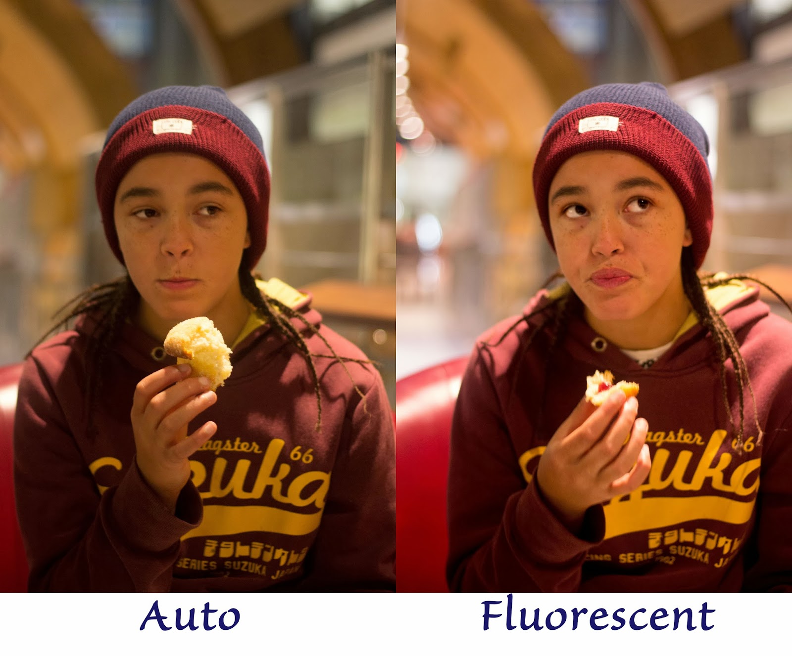
My next image was taken in a coffee bar under what I assume to be the CFL type lamps described in the brief for this project. These types of bulb look like tungsten lamps but it is clear from my results that they are actually fluorescent.
In this pair of images, the image taken on auto is greener than that on the fluorescent setting, the opposite of the previous experiment. In the left hand image, the colours appear washed out and the image rather dull. The image using the fluorescent setting, although slightly too pink, is closer to the actual colours seen on the day and much more vibrant.

The fluorescent setting has had quite different results on the two images because there are different types of fluorescent lighting. As my camera only has one fluorescent setting for white balance, I will always have to be careful when shooting in indoor public areas. For most sitautions, white balance will have to be corrected where possible when editing.