Links: Pinterest
My aim in this assignment is to show how colour can be
used in order to make a photograph more balanced as well as creating harmony
and tension using complementary and contrasting colours respectively.
Complementary colours are those which face each other
across the colour circle, such as red and green or orange and blue. The values poet,
J.W.Von Geothe assigned to the primary and secondary colours according to their
brightness are; yellow 9, orange 8, red and green 6, blue 4 and violet 3. These
values can be used to enable us to create the correct proportions of colour in
an image, those for complimentary colours being;
red:green – 1:1
orange:blue – 1:2
yellow:violet
– 1:3
Harmony can also be created using similar colours, those
which are close together on the colour wheel. This often consists of placing
warm colours together such as red and orange or cool colours such as blue and
green.
Colours spaced a third of the
way round the colour wheel such as blue and red can create a striking contrast,
sometimes to the point where they clash. This contrast can be used to create more
striking images.
These colour combinations can
also be used in the form of accent colours; created when a large area of colour
is broken by a small splash of another colour. The uneven proportion of colour
can create added tension in an image.
In completing this
assignment, I have really struggled to create one cohesive set of images. While
trying to develop my creative voice, especially with regards to colour, I have
found myself flipping between the two extremes of my personality. I love
colour; bold, bright, vibrant colours in big blocks appeal to the extrovert in
me while my quiet, nature loving side feels at peace around the muted tones of
a sun-bleached landscape... but do I have to choose?
My research first took
me to a photographer described as a genius in colour, William Eggleston.
Eggleston has a very distinctive style combining ordinary, everyday subjects with
strong colours, often with a stylised, over processed feel. Whether
photographing a bike or an elderly lady, Eggleston’s slightly surreal images
evoke a tension akin to that of a Hammer horror film. Having originally worked
in black and white, this photographer thrived at the introduction of colour;
selective use of colours complement the awkward angles already used to create
that Eggleston tension; this is an artist with a clearly defined voice.
Vienna born Ernst Haas
became the premier colour photographer of the 1950s in the United States. Haas mainly
uses colour subtly to create abstract images. His individual style, although
distinct feels much broader than Eggleston’s with more variety in technique and
subject matter.
One of my favourite
photographers for his use of colour is Jay Maisel; Although Maisel has
photographed many celebrities, I am more drawn to his distinct use of colour
and light. The two images shown below are very different in tone and strength
of colour; the vibrant, contrasting red and blue and the more muted, complimentary
red and green evoke quite different feelings and it would be easy to think they
were taken by different photographers. On viewing more of Maisel’s work, the
link becomes apparent in his segmentation of colour; the third image, ‘Restaurant
Roof’ shows that Maisel uses the same style when working with light.

As we move towards the more subtle hues of natural landscapes, the image ‘08 – Party Light’ creates a link between the two genres displaying the orange plastic against the earthy tones in the wood. As landscapes move from countryside to the Humber Estuary, we come full circle with a vibrant close up of the warning sign set against a contrasting blue sky.
01 – Text Talk: This image shows a red mobile phone
cover against the green backdrop of a garden lawn. The complimentary colours are balanced in a 1:1 proportion, consisting
of similar amounts of each hue. The visual simplicity of this image allows us
to consider the significance of the image; the hands cradling the phone showing
the importance of technology today.

02 – Sun Salutation: The 1:3 proportion of yellow to its
complimentary violet creates harmony in
this image. Had the photograph been taken from above, showing the petals to
their full extent, the violet may have overpowered the yellow. This side view
lessens the proportion of the violet area, creating balance. The deep green
backdrop enhances the vibrancy of the image.

03 – Bins: The contrasting
colours of the bins attracted me instantly but as they were in a busy festival
field, it was difficult to get a shot from the right angle. On the last morning
whilst eating breakfast, I finally got my shot. I composed in order to include
less orange than green in line with Geothe’s proportions.

04 – Cool: This image shows how desaturation can affect
the balance of an image. Although the proportion of complimentary hues, orange:blue is around 1:2, fitting with
Geothe’s values, the orange drink obviously stands out as the main focus of the
image. Factors such as depth of field and perspective play a part, however the intensity
of the orange compared to the subtle blues really swing this balance. Where the
blue background would have cooled the image, over-exposure creates a hot, white
area to the right. I like the imbalance in this image; for me it creates a
certain amount of tension which fits with the need for a cool drink on a hot
day.

05 – Sundance: The yellow
t-shirts fit perfectly with the outdoor environment as they link harmoniously
with the grass and sky. I felt that using the greenery alone as a backdrop
would create an overly yellow image; therefore I adopted a low angle to include
more sky. As yellow, green and blue flow through the colour wheel mainly on the
cooler side, harmony is created through similarity. The blue and green
accents in the dancers’ outfits add a smaller, yet more intense version of
these hues, balancing the bright yellow.

06 – Noisy Toys: This image shows
an imbalance in colour which fits perfectly with the subject matter. The yellow
hues in the banner and grass dominate the image, broken up by the purple
accents in the text and backpack. Had the hues been reversed, the complimentary
colours would be much more balanced, however the tension created works with the
nature of the image.

07 – Flame: Used as an accent
colour, the lady’s bright orange hair contrasts dramatically with the
greens of the grass and her vibrant clothing. Furthermore, there is a distinct
imbalance in strength of colour as the lady’s friends are dressed in more muted
tones.

08 – Party Light: The orange accent created by the light provides a vibrant contrast to the green striped fence. This is softened by the rust
colours and earthy muted tones.

09 - Amber: The upper portion
of this image is filled with warm, golden hues. Although a similar
colour, the cooler green of the t-shirt balances this warmth. Although a small
part of the shot, I feel that the inclusion of the red trouser leg draws the
eye to the similarly coloured lips, bringing attention to the girl’s face.

10 – Dawn: The early morning
light warms the similar golden yellows and greens of the fields. The
violet sky subtly complements the yellow while its contrast to
the green below wakes up the sleepy morning scene.

11 – Meadow: The yellow dandelion
provides an accent to the similarly coloured greens; however I
feel that it is the complimentary link between the yellow and violet
which creates the harmony in this image. Without the yellow accent, the green
and violet create too sharp a contrast for such a relaxing image. If the violet
were omitted, the similarity of the green and yellow would not create enough
impact to generate interest.

12 – Dandy: The contrasting
green and violet create a vibrant backdrop for the colourless clock; though the
muted tones prevent the subject from being lost.

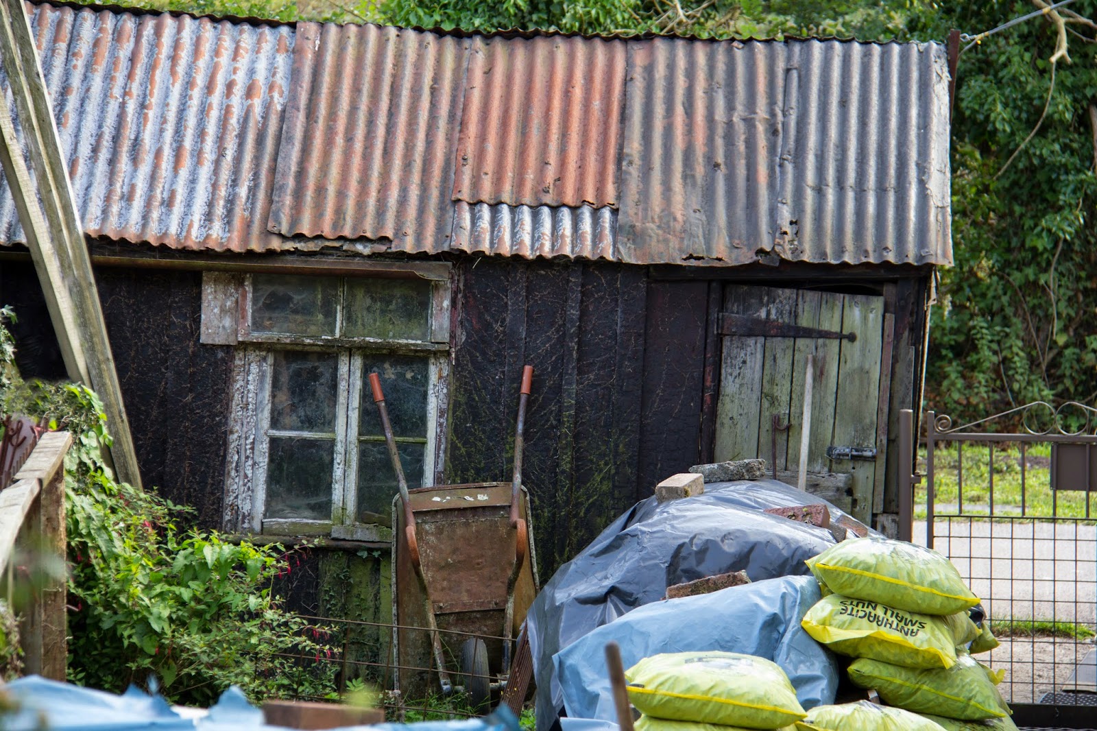
13 – Shack: Instinctively, I
felt that the colours in this image balanced very well but didn’t really think
about why until I had uploaded the image. The main subjects of the image are
made up of the three contrasting hues; blue, red and yellow. The plastic
sheeting and roof show the largest area but most muted tones of blue. Also on
the roof and in the barrow, slightly smaller areas yet brighter tones of red
are shown and then smaller yet more saturated patches of yellow are present in
the bags. I feel that the green elements to the corners add a softness to an
otherwise contrasting image.
14 – Ring: The similar
hues of warm red and violet create a peaceful image with just enough blue to illustrate
the coolness of a walk on the banks of the Humber. In a balanced image, the
proportion of red:violet would be 2:1; however the sharper focus and detail in
the ring aide to rectify the balance.

15 – Humber Accent: Warm hues are used in this image,
using pale violet and pink with a red accent. A contrasting accent would have created
great impact; however, as the image consists of similar colours, the boat sits calmly, adding interest but not detracting
too much from the peaceful nature of the overall image.

16 – Warning: The calm blues are
rudely awoken by the bright yellow warning sign while, although desaturated,
the red highlights in the sky add to the contrast. Some harmony is restored
by the muted violet river.

I have always had a
fascination with colour and how it makes us feel so have enjoyed taking this
interest further into the effects of varying colour combinations. I have
intentionally steered away from staged scenarios as, although my style is still
developing, I know that that I am much more attracted to real life situations.
In some ways, I feel that this has made it more difficult to create a cohesive
set as the colours have to exist in order to be photographed, however the added
challenge has aided to open my mind to the world of colour. I feel that as I
progress in the world of photography, this will be a significant aspect of my
work.
All images from this assignment can be seen in the corresponding Flickr
album.
No comments:
Post a Comment